Automated pass over the 52 papers in module-1-pdfs/
(plus the course markdown) looking for figures worth reworking into the Class 1 explainer.
96 candidates across 11 course sections/buckets — deliberately erring toward
too many rather than too few, per request. Each card links to the rendered screenshot,
a full-size version, and the exact page of the local source PDF. The already-built figures
(Lindsay et al. monitor+accept cortisol chart, Baten et al. 2026 brain figure) are intentionally
excluded — nothing here duplicates those.
This is a rough-cut reference list, not a finished design pass — confidence badges reflect how visually "explainer-ready" the raw figure already is, not how important the underlying research is. Many Low items are included purely for topical completeness (e.g. dry PRISMA/forest plots, dated stats-package plots) and would need a redraw if used at all.
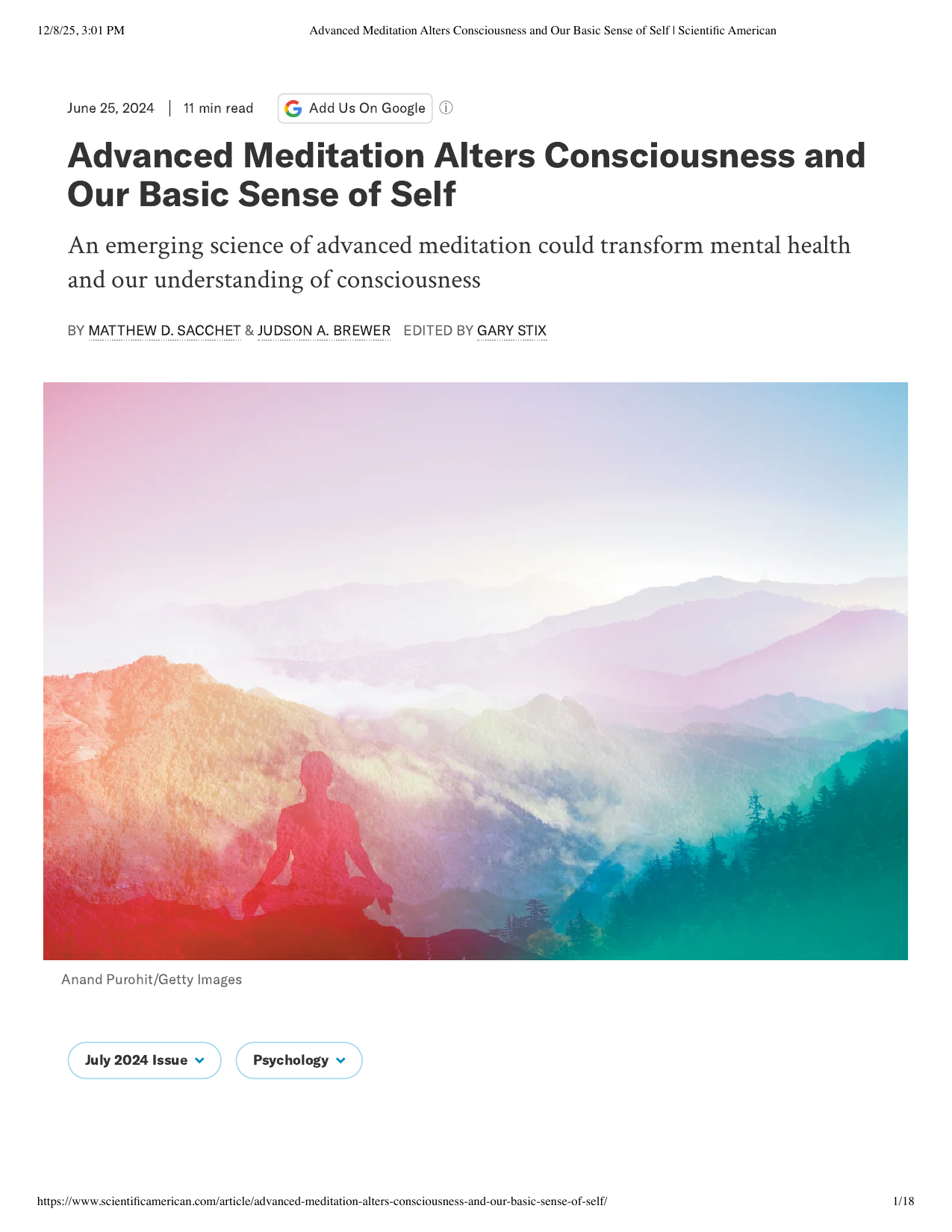
Shows: A striking rainbow-gradient photo illustration of a meditator's silhouette dissolving into/superimposed on a misty mountain landscape.
Why engaging: Genuinely beautiful, professionally-produced hero art (not a data figure but a mood-setting illustration) — perfect as a section-opening visual, and doubly relevant since it's literally authored by the course's own instructor.
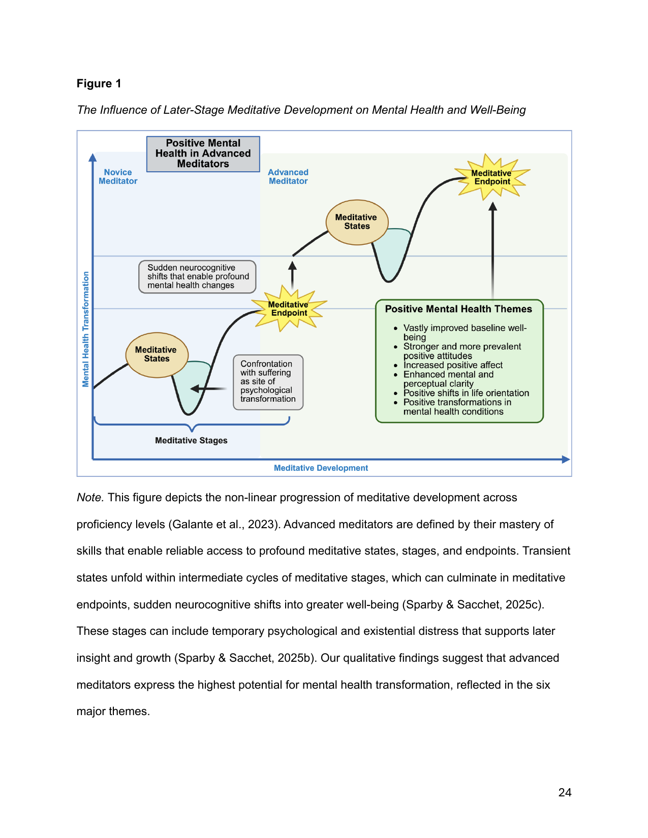
Shows: A conceptual diagram plotting "mental health transformation" against "meditative development," showing recurring cycles of meditative states/stages culminating in sudden "meditative endpoint" shifts, plus a callout box listing six positive mental health themes (improved wellbeing, positive affect, mental clarity, etc.).
Why engaging: This is a beautifully designed, purpose-built conceptual figure (not a data plot) that visually narrates exactly the "global shifts" story the course wants to tell — directly anchors section 5 and could likely be reused/adapted almost as-is.
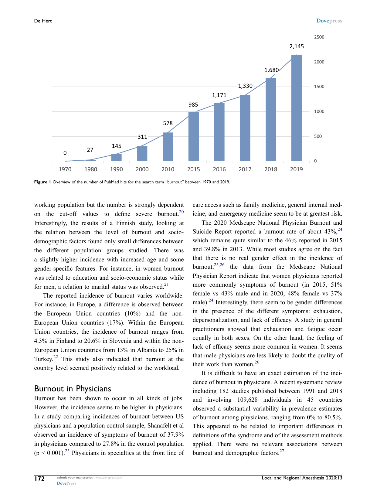
Shows: A simple combined bar/line chart showing the number of PubMed publications on "burnout" growing from 0 (1970) to 2,145 (2019).
Why engaging: A clean, striking "explosive growth of scientific interest" chart — same visual grammar as the meditation-research-growth story, applied to burnout.
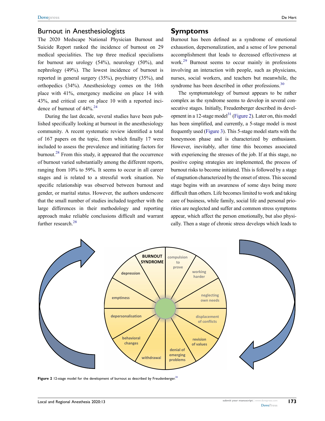
Shows: A circular wheel diagram of the 12 sequential stages of burnout (compulsion to prove oneself → working harder → neglecting own needs → ... → depression → burnout syndrome at the center).
Why engaging: Visually distinctive circular/wheel diagram — much more engaging than a bulleted list, good candidate for an explainer callout on "what burnout looks like."
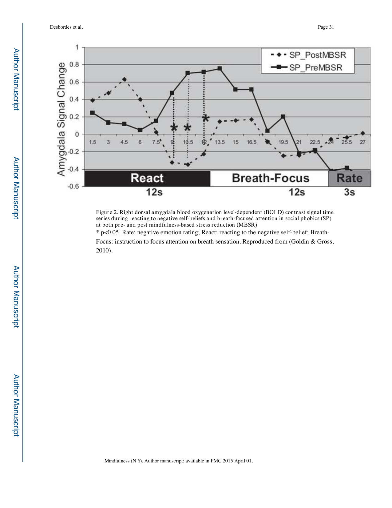
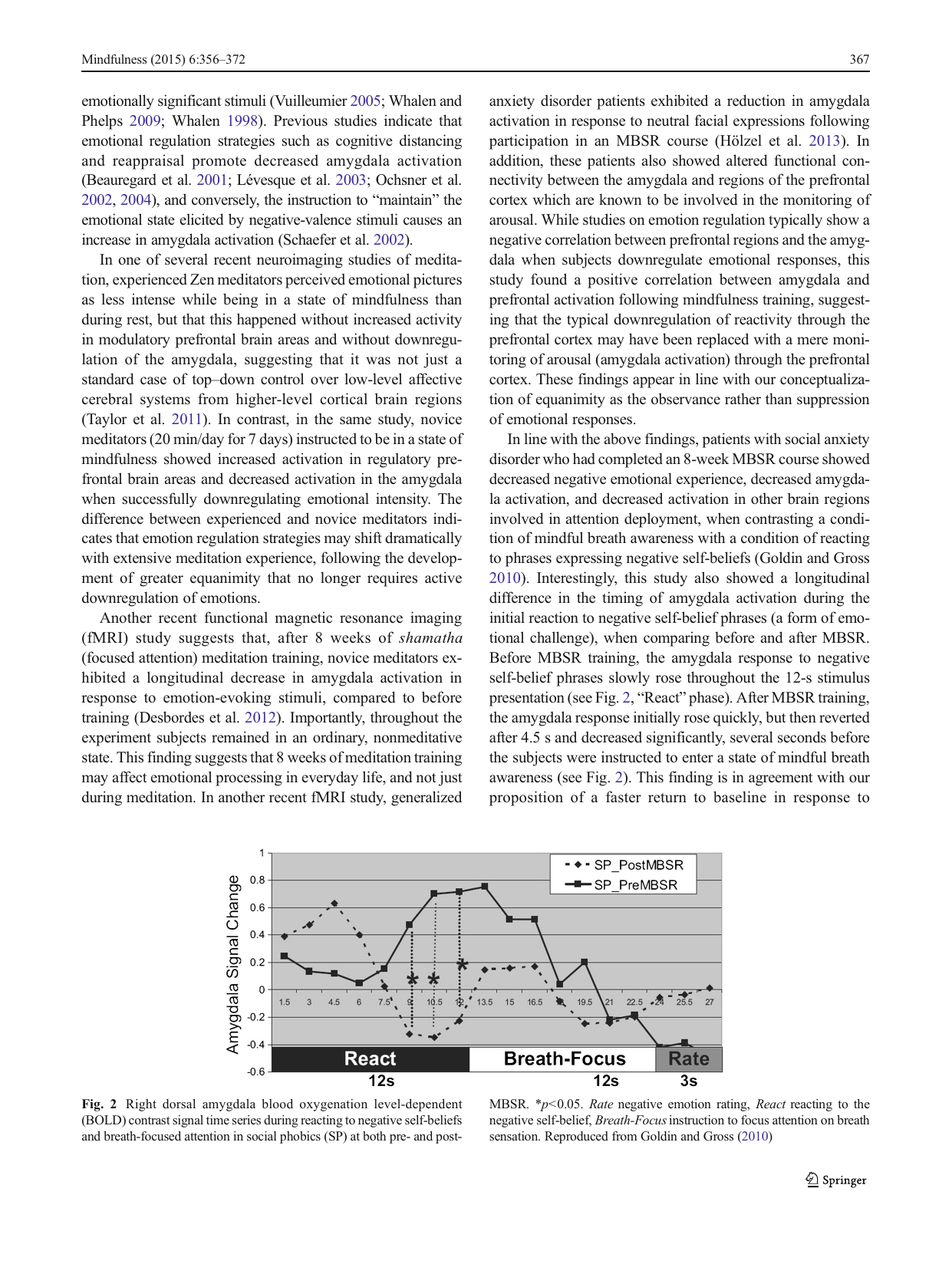
Shows: A line chart of amygdala activity over time while reacting to negative self-beliefs then shifting to breath-focused attention, before vs. after 8 weeks of MBSR — post-MBSR the amygdala response is much lower and recovers faster.
Why engaging: Directly visualizes "MBSR calms the brain's threat response" with a real before/after brain-signal chart — strong evidence-based visual for the MBSR mechanism story.
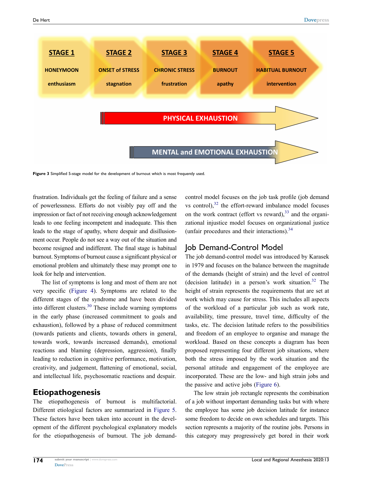
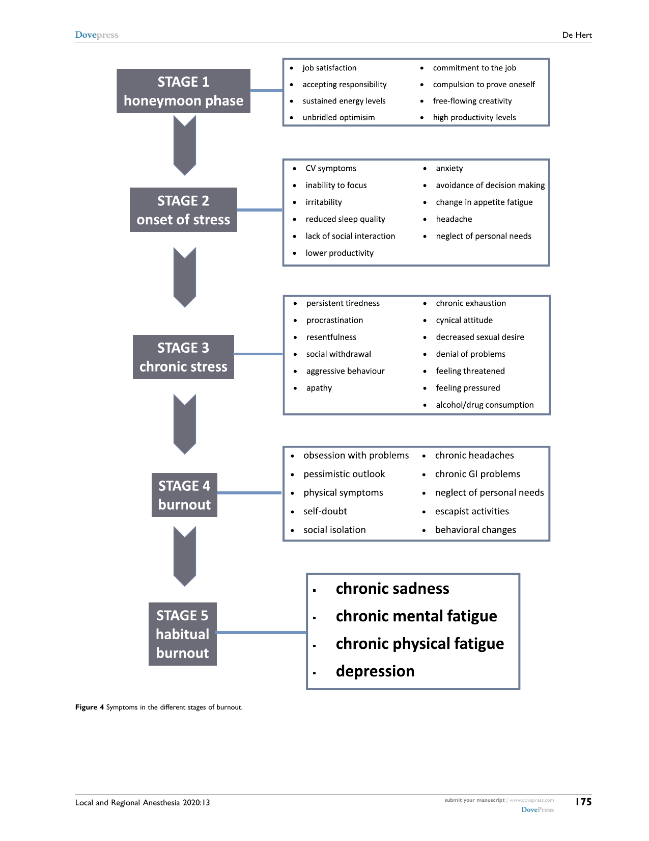
Shows: A clean 5-arrow horizontal timeline (Honeymoon → Onset of Stress → Chronic Stress → Burnout → Habitual Burnout), with overlaid gradient bars for physical vs. mental/emotional exhaustion.
Why engaging: Extremely clean, modern-looking arrow/timeline graphic — probably the single most "ready to reuse" figure in this whole batch.
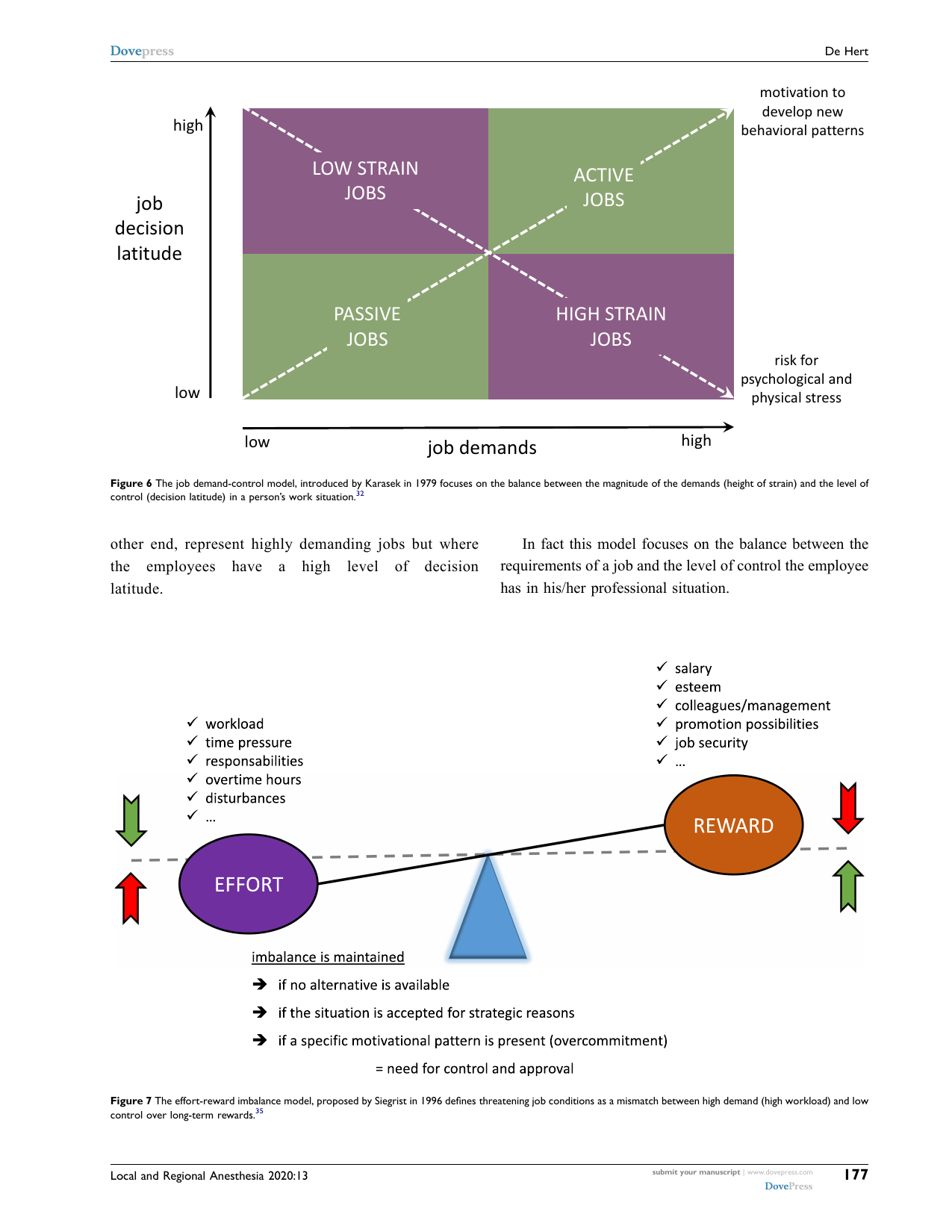
Shows: A 2×2 colored quadrant diagram (job demands × decision latitude) defining Low Strain / Active / Passive / High Strain jobs, with diagonal arrows toward "motivation" vs. "risk for psychological/physical stress."
Why engaging: Classic, visually clean 2x2 framework diagram — very reusable/redrawable and intuitively explains why some clinical jobs are especially burnout-prone.
Shows: A literal seesaw/balance illustration with "Effort" (workload, time pressure...) on one side and "Reward" (salary, esteem, promotion...) on the other, tipping out of balance.
Why engaging: A fun, intuitive metaphor-as-diagram (a seesaw) — very easy to reskin for a course explainer and instantly understandable without reading any text.
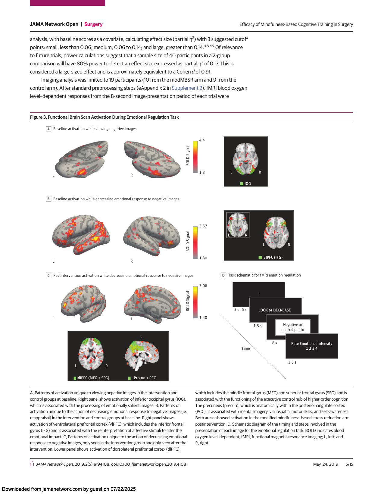
Shows: A four-panel figure showing colorful fMRI brain-surface renderings of surgical trainees' emotion-regulation activity before/after a modified MBSR program, plus a schematic of the task timeline.
Why engaging: Visually rich, colorful brain renders combined with a clear task-design diagram — exactly the kind of "science made visual" figure that elevates a slide, and it's about surgeons specifically (very on-theme for a healthcare-professional audience).
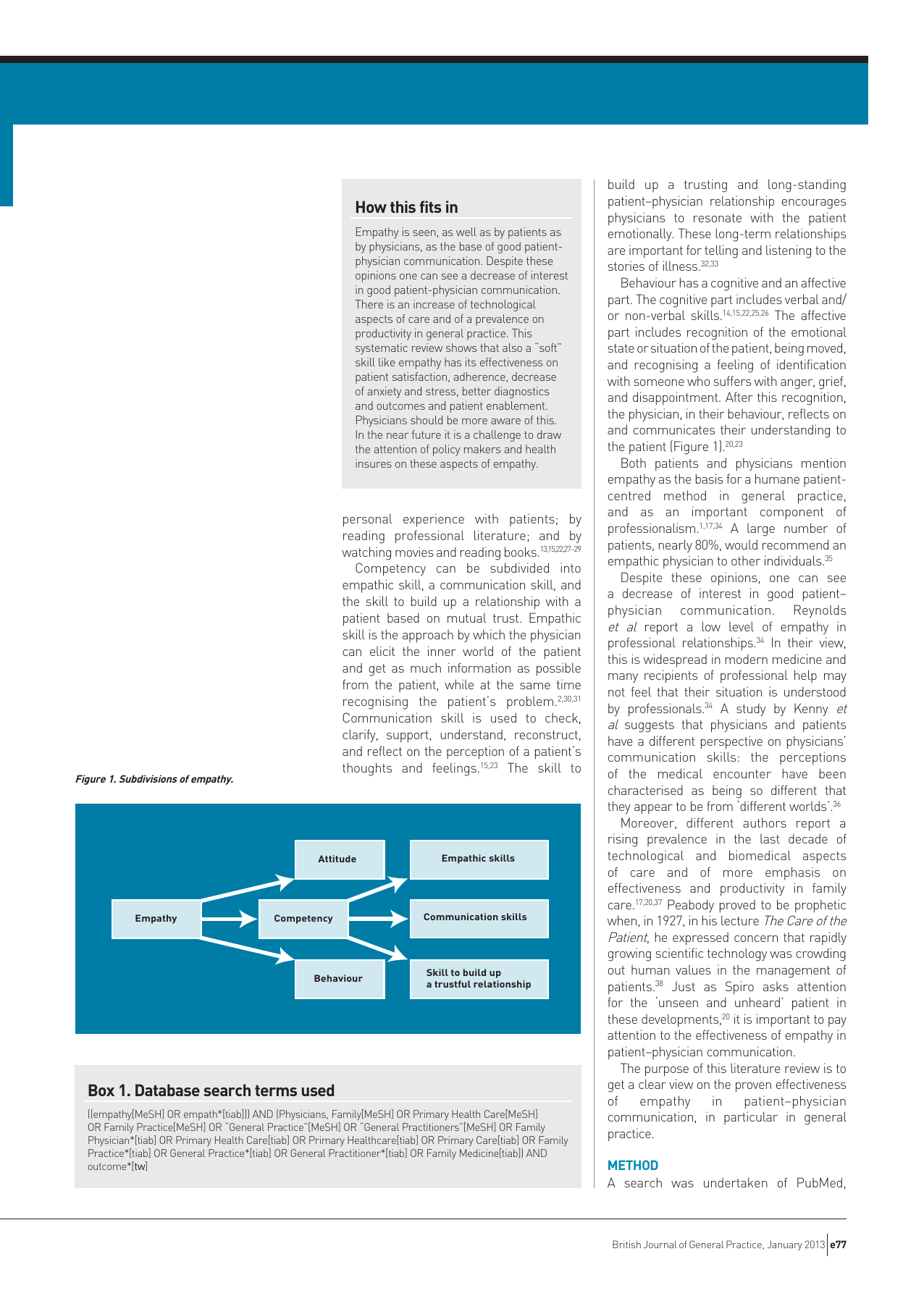
Shows: A simple flowchart breaking "Empathy" down into Attitude/Competency/Behaviour, which in turn map to Empathic skills/Communication skills/Skill to build a trustful relationship.
Why engaging: Clean, minimal box-and-arrow diagram — a good visual definition of "empathy" for the section on why clinicians benefit from cultivating it, much more digestible than prose.
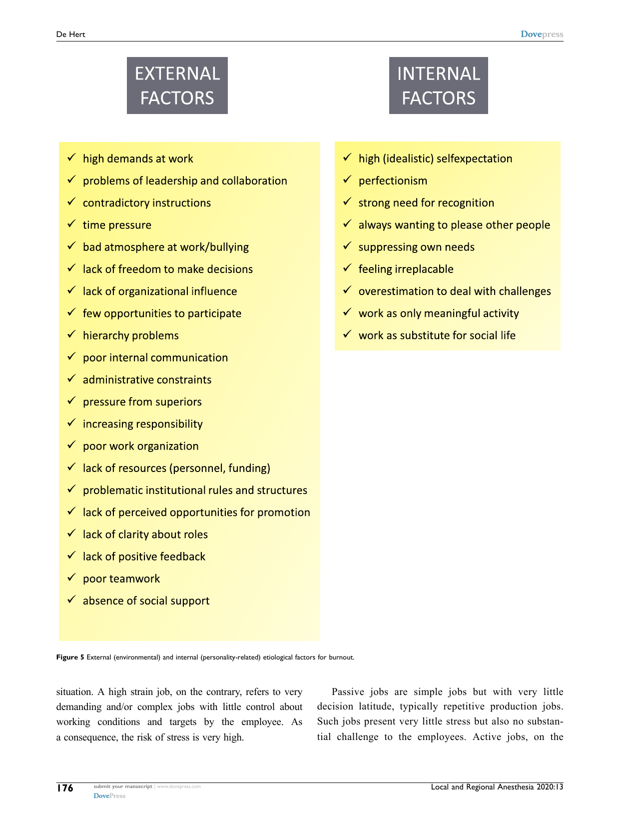
Shows: Two clean checklist columns — "External Factors" (workload, poor teamwork, lack of resources...) vs. "Internal Factors" (perfectionism, need for recognition, overestimating one's ability to cope...).
Why engaging: Simple two-column contrast graphic that would translate well into a lightweight explainer callout on "why clinicians burn out."
Shows: A line graph of amygdala BOLD signal reacting to negative self-belief phrases before vs. after 8 weeks of MBSR, showing faster emotional recovery post-training.
Why engaging: A clean two-line time-series chart with clearly labeled "React / Breath-Focus / Rate" phases — good concrete evidence that meditation training changes emotional recovery speed.
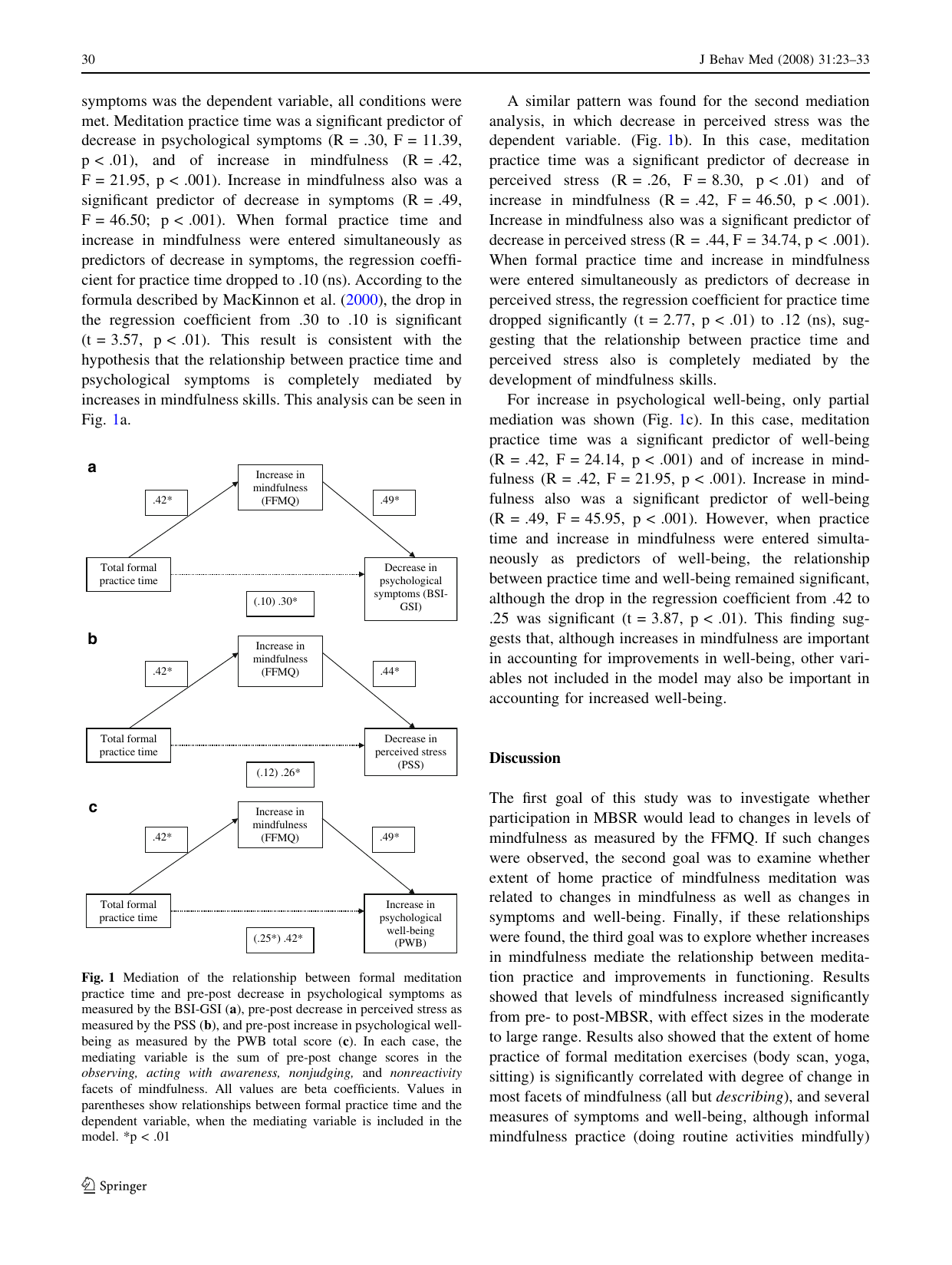
Shows: Three path diagrams (a, b, c) showing that increases in mindfulness fully or partially mediate the relationship between meditation practice time and decreases in psychological symptoms/stress and increases in well-being.
Why engaging: Gives a visual causal chain ("practice → more mindfulness → less stress") that's easy to translate into a simple explainer arrow-diagram; as printed it's fairly dense statistical notation.
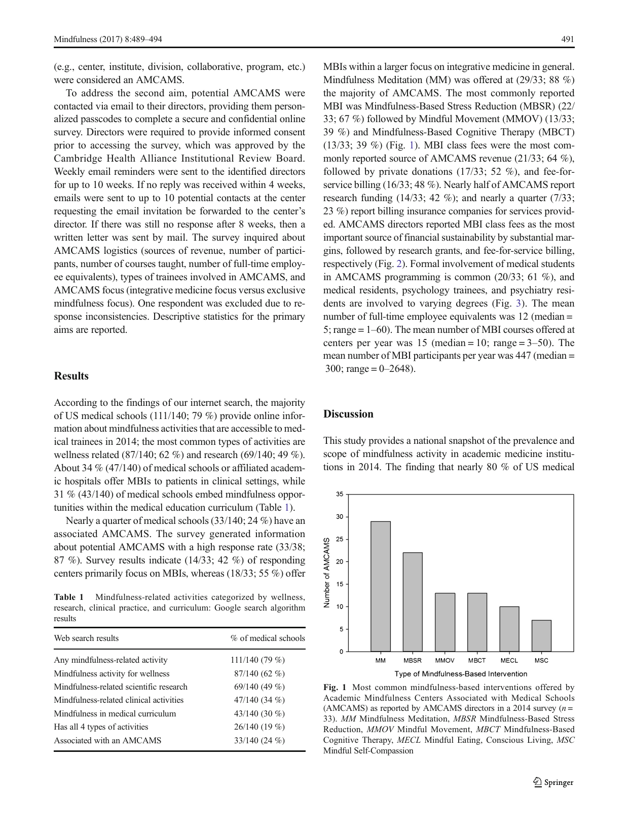
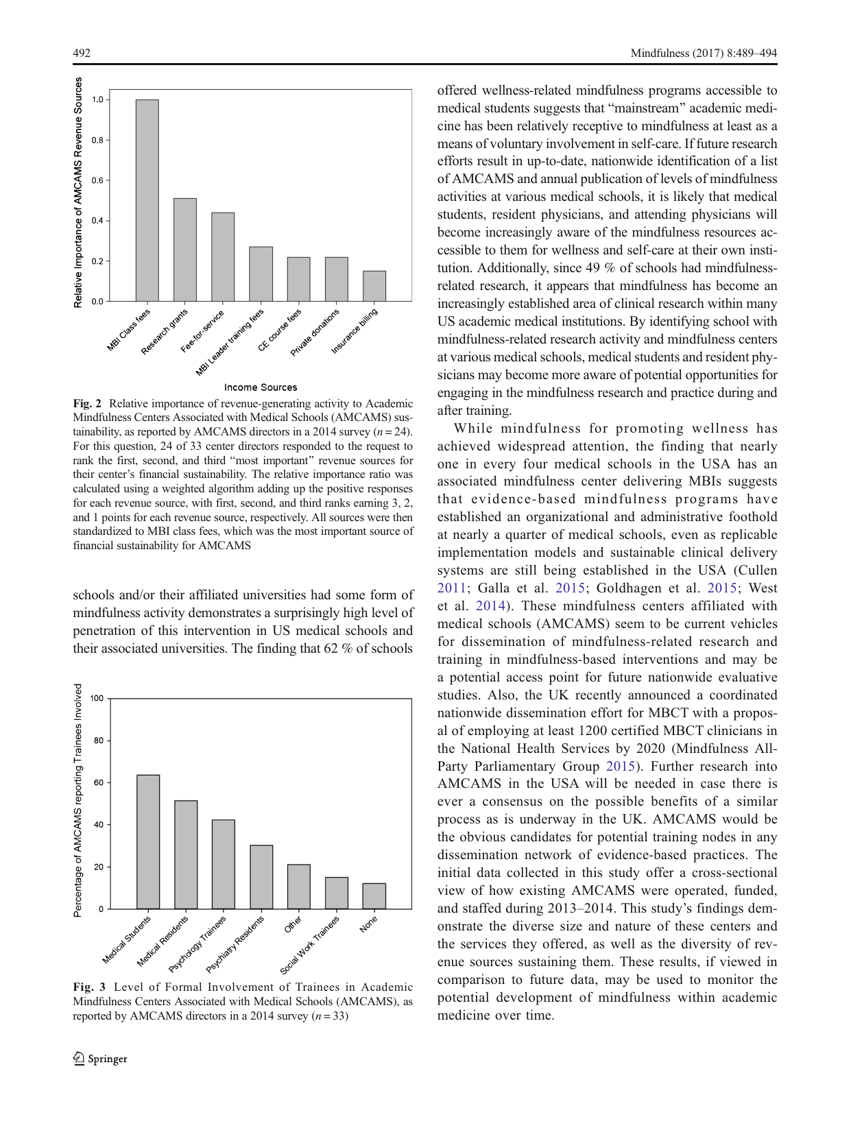
Shows: A simple bar chart of how many Academic Mindfulness Centers (out of 33 surveyed, at US medical schools) offer each type of program (Mindfulness Meditation, MBSR, Mindful Movement, MBCT, etc.).
Why engaging: Concrete evidence that mindfulness has an organizational foothold inside mainstream academic medicine; clean, simple bar chart.
Shows: Bar chart of what percentage of academic mindfulness centers formally involve medical students, residents, psychology/psychiatry trainees, etc.
Why engaging: Shows mindfulness is being formally taught to the next generation of clinicians, not just offered as a side perk; simple, readable bar chart. (Fig. 2 on the same page — revenue sources — is on this same rendered image but is less relevant/interesting.)
Shows: The same 5-stage arrow structure as Figure 3, but each stage now lists its specific symptoms (e.g., stage 3 "chronic stress": persistent tiredness, cynical attitude, alcohol/drug consumption).
Why engaging: Good detail-view companion to Figure 3, but denser/more text-heavy — best used as a secondary/expandable panel rather than the hero image.
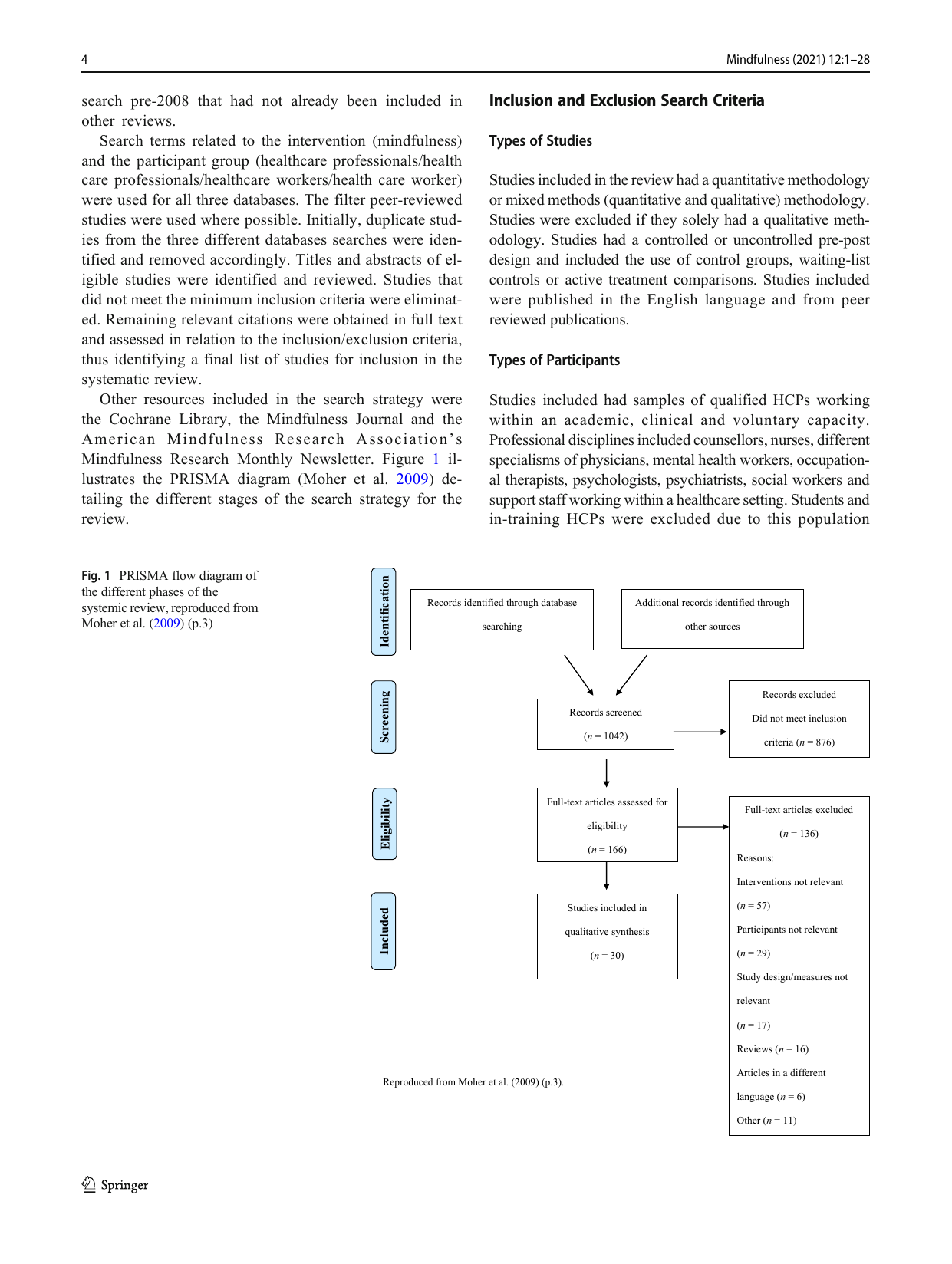
Shows: A standard PRISMA diagram tracing the review's search-and-screening process from 1042 records down to the final 30 included studies on MBSR for healthcare professionals.
Why engaging: A clean, familiar visual shorthand for "this is a rigorously reviewed evidence base of 30 studies," useful for briefly establishing credibility without a wall of citations.
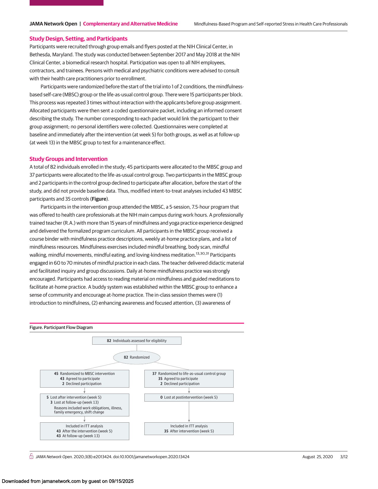
Shows: A standard CONSORT-style flow diagram of participant recruitment/allocation/attrition for a mindfulness-based self-care trial at NIH.
Why engaging: Concretely shows a real mindfulness-for-clinicians RCT existed at NIH; visually it's a fairly generic/dry flow chart though.
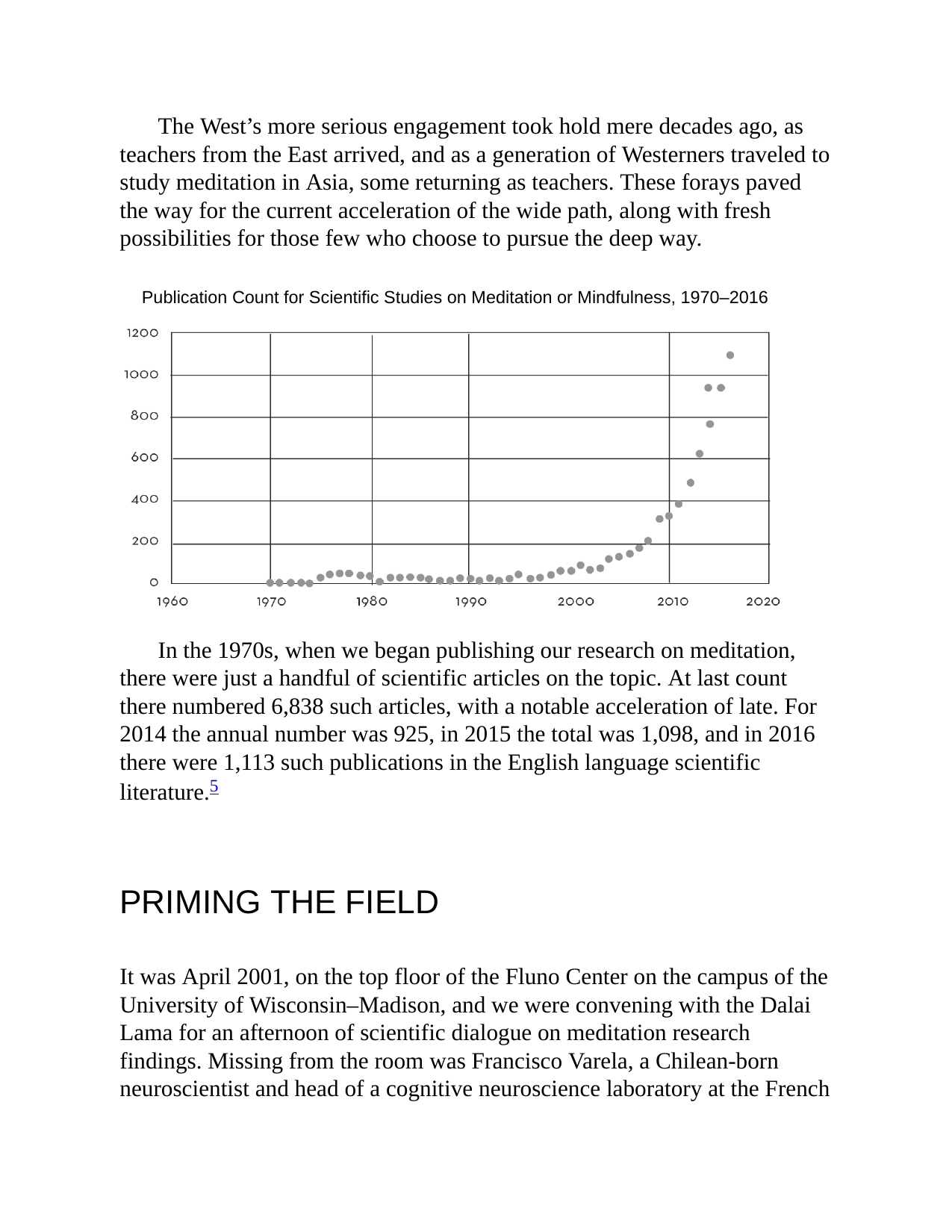
Shows: A scatter/line chart titled "Publication Count for Scientific Studies on Meditation or Mindfulness, 1970–2016," showing near-zero output through the 1980s–90s and a steep exponential rise after ~2005, reaching over 1,100 publications/year by 2016.
Why engaging: This is a ready-made, on-topic replacement for the placeholder "Google-Trends-style" growth chart mentioned in the brief — clean, simple, and it directly supports the "three waves" / mainstreaming narrative.
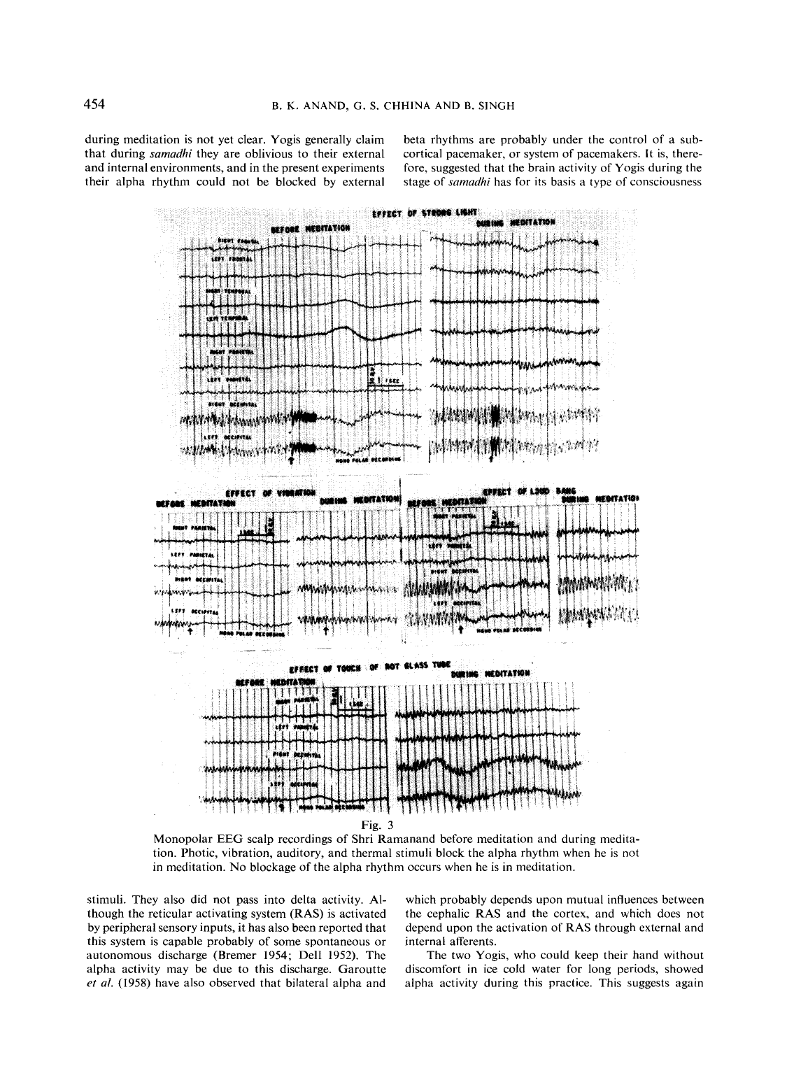
Shows: Side-by-side raw EEG traces from a yogi before vs. during meditation, showing that strong light/loud noise/vibration/touch all disrupt the resting alpha rhythm, but none of them disrupt it while he is in meditation (samadhi).
Why engaging: A genuinely striking historical "before/after" comparison — the literal founding data of the scientific study of meditation, on period analog EEG paper.
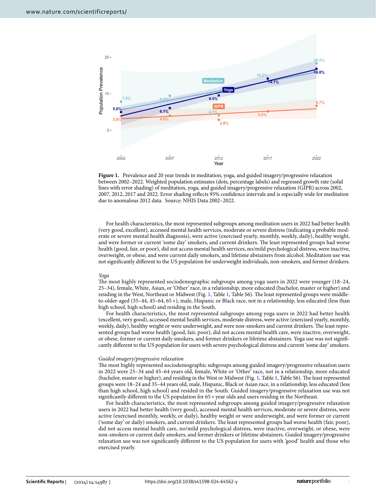
Shows: A clean line chart of US national survey data (NHIS) showing meditation use rising from 5.0% (2002) to 18.3% (2022) of the population, compared with yoga and guided imagery/relaxation.
Why engaging: Exactly the "meditation goes mainstream" growth chart the brief calls out as wanted — real national data, clean multi-line trend chart with labeled percentages.
Shows: A simple scatter plot showing that the "grade" of EEG change during Zen meditation (I–IV) tracks closely with years of Zazen training experience.
Why engaging: One of the earliest data points for "meditation skill scales with practice" — a simple, legible historical scatter plot that supports the course's proficiency/practice narrative.
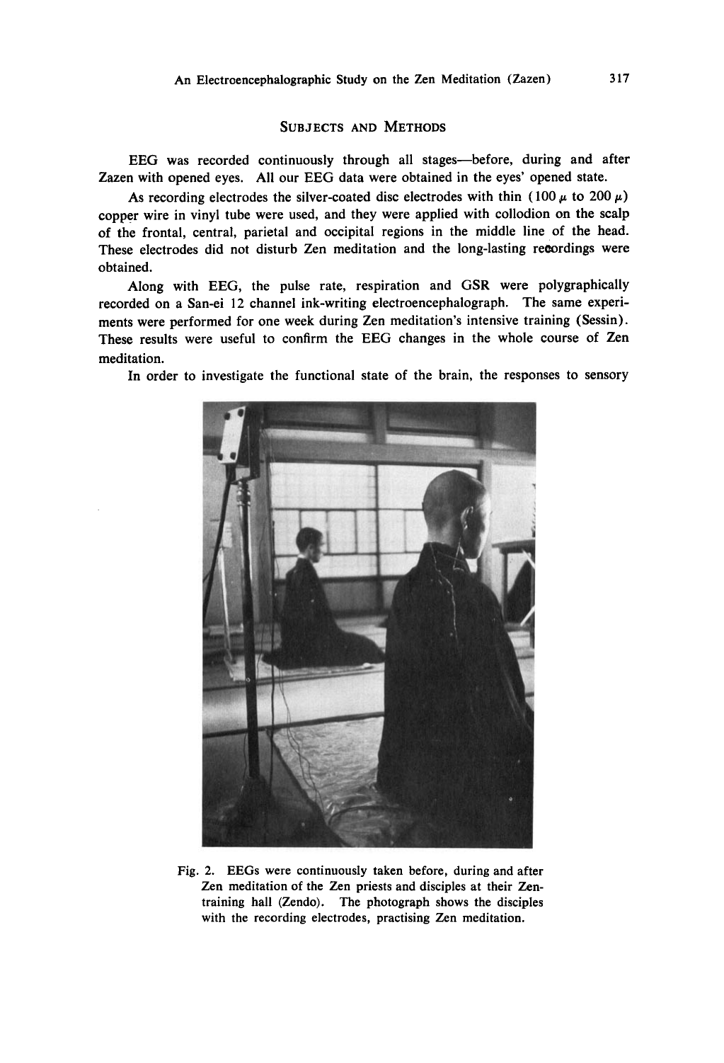
Shows: A black-and-white photograph of Zen priests meditating in a training hall (Zendo) while wired with EEG electrodes, from the original 1966 study.
Why engaging: A striking, authentic historical photo — priests in robes with cables/electrodes — that visually captures "science meets contemplative tradition" better than any modern stock image.
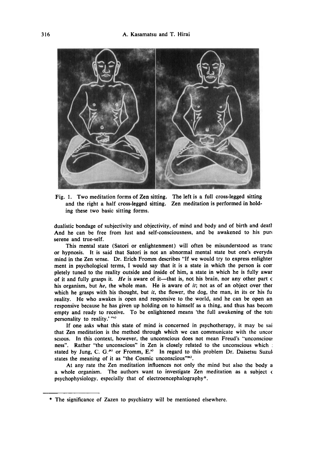
Shows: A hand-drawn illustration of the two traditional Zen sitting postures (full and half cross-legged) used in the original 1966 EEG study of Zazen.
Why engaging: A charming, historically evocative line illustration that visually anchors the "first wave" of scientific meditation research in a way plain text cannot.
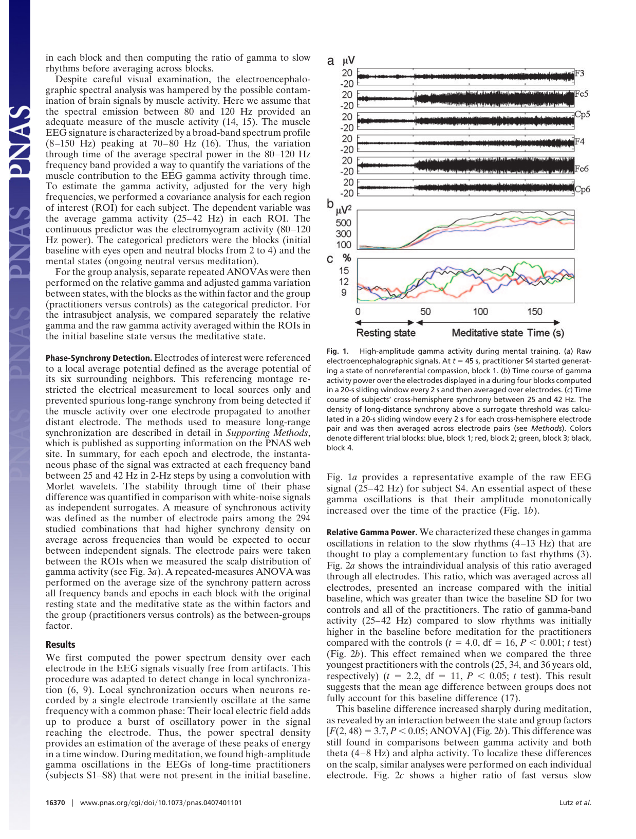
Shows: A three-part figure: raw EEG traces from a long-term practitioner, then the time course of rising gamma-wave power, and rising cross-hemisphere synchrony, all increasing sharply once meditation begins.
Why engaging: The classic "monk brain lighting up" visual from contemplative neuroscience — a compelling, historically important demonstration that advanced practice produces measurable, dramatic brain changes.
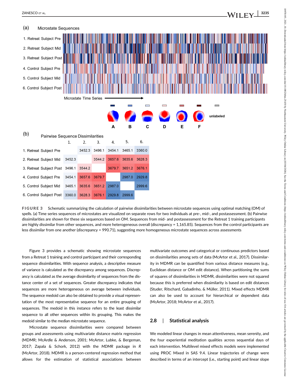
Shows: Colorful horizontal "barcode" style visualizations of brain-microstate sequences over time for meditators vs. controls, plus a color-coded matrix of how similar/dissimilar each person's brain-state sequence is to others.
Why engaging: Visually unusual and striking (looks like a genetic barcode or heat-strip), a good "here's what sophisticated brain-state analysis looks like" visual for illustrating research rigor.
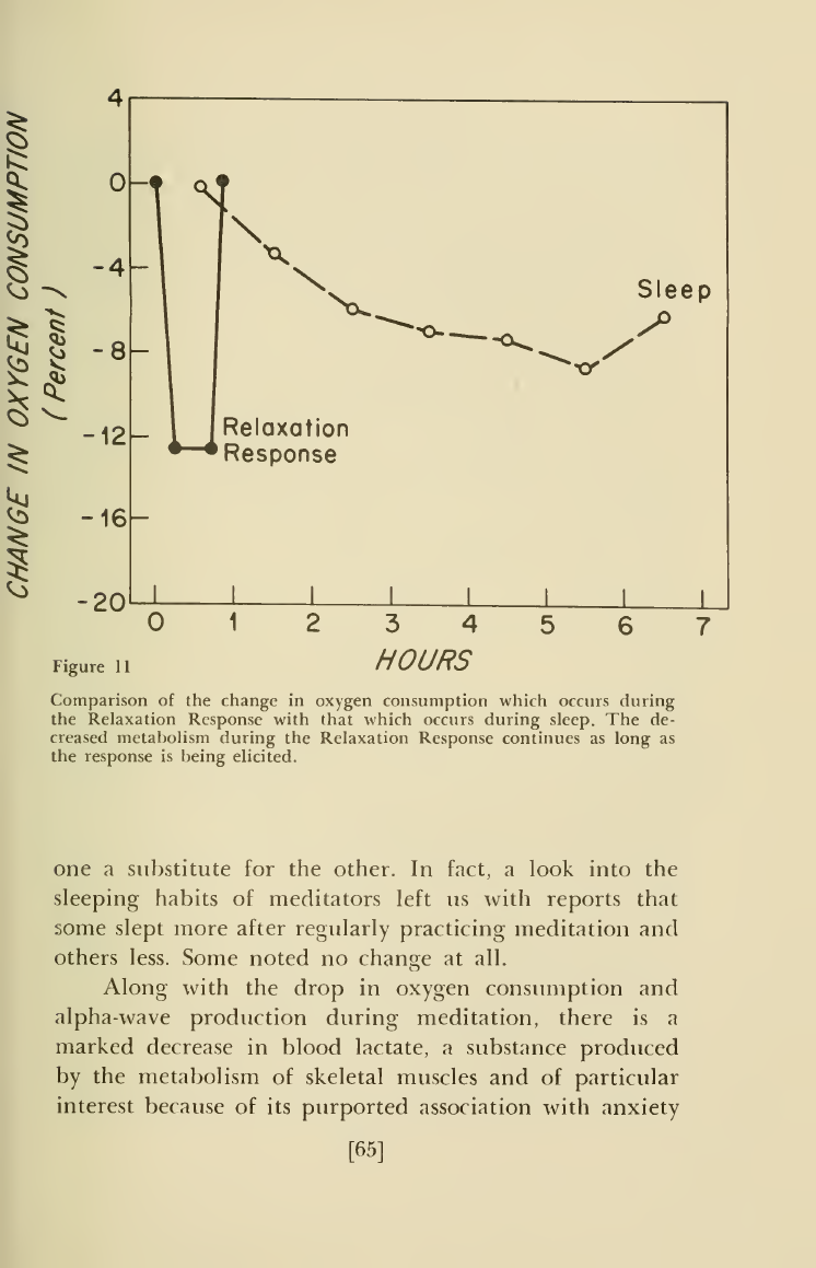
Shows: A hand-drawn 1970s-style line chart comparing the drop in oxygen consumption during the "Relaxation Response" (fast, ~12% drop within minutes) vs. during sleep (slow, gradual ~8% drop over hours).
Why engaging: This is literally Benson's own original chart from the book that popularized meditation's physiological benefits in the West — a great historical/vintage visual directly tied to the cited source, showing meditation achieves in minutes what sleep takes hours to do.
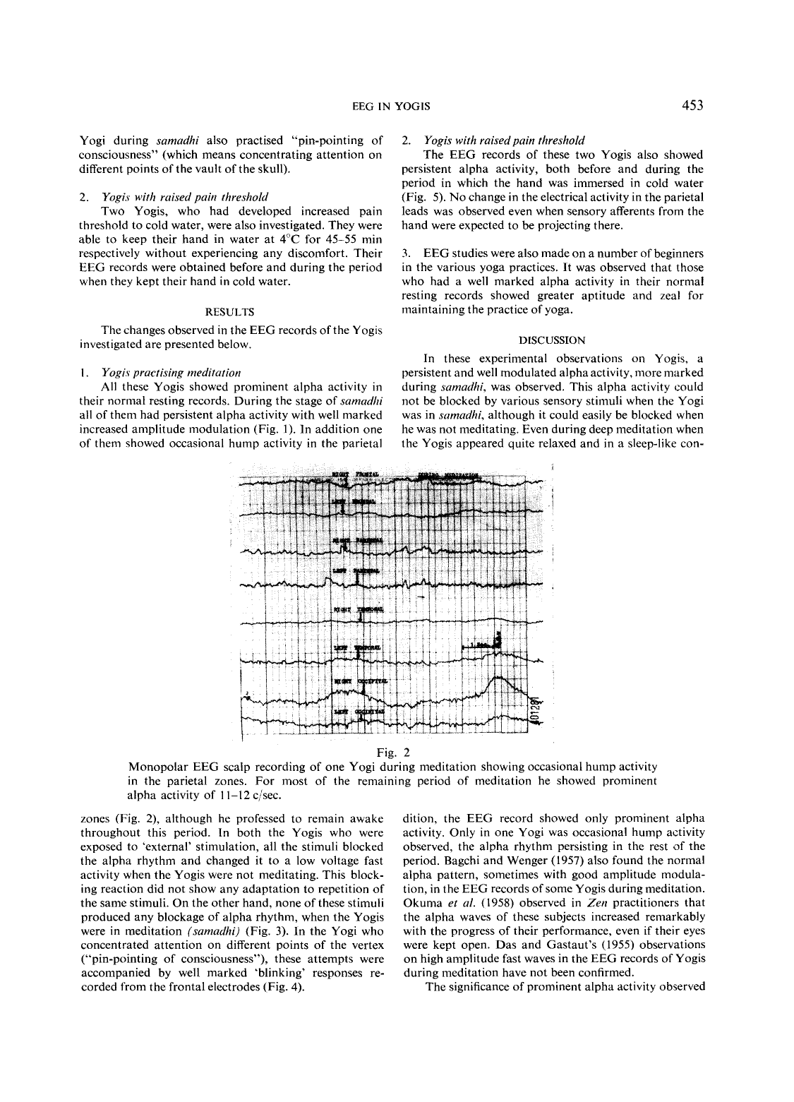
Shows: Raw EEG trace of a yogi during meditation showing sustained 11–12 c/sec alpha activity with occasional "hump" waveforms in the parietal region.
Why engaging: Authentic period artifact reinforcing the historical-origins narrative; secondary to Fig. 3 above.
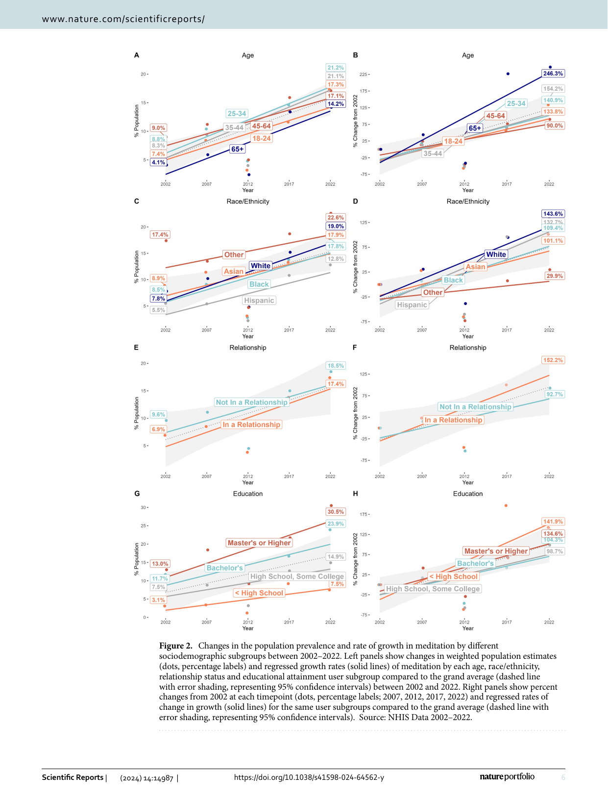
Shows: An 8-panel grid of line charts breaking down meditation's 2002–2022 growth by age, race/ethnicity, relationship status, and education level (both in raw % and % change from 2002).
Why engaging: Rich, real demographic detail on who is driving the meditation boom; more valuable as background/supplementary data than as a single hero visual since it's dense with 8 sub-panels.
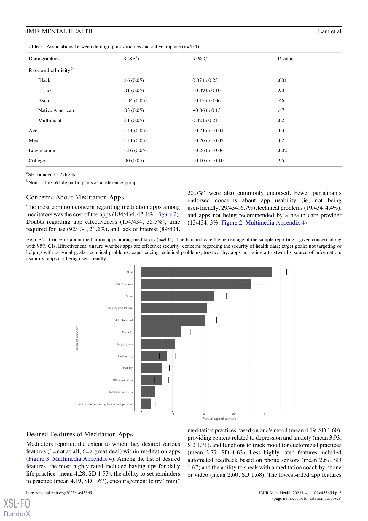
Shows: A clean horizontal bar chart of the most common concerns meditators report about meditation apps (cost, effectiveness doubts, time, disinterest, etc.), with 95% CIs.
Why engaging: Simple, single-panel, immediately readable bar chart that could illustrate "meditation has gone mainstream via apps, but people still have real barriers."
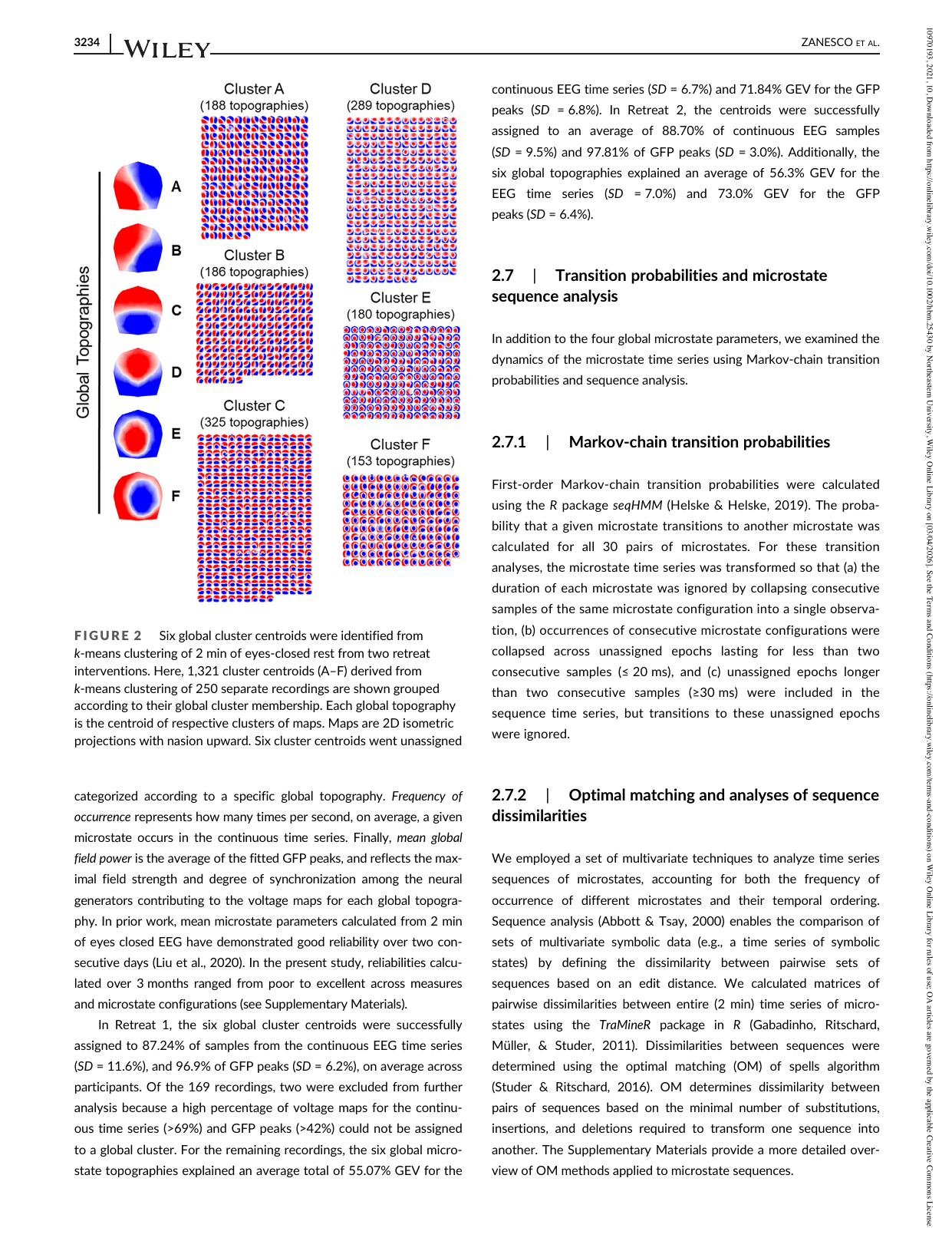
Shows: Six labeled (A–F) red/blue "butterfly" head-shaped topographic maps representing recurring brain-electrical-activity patterns ("microstates") identified via EEG clustering.
Why engaging: The six colorful head-shaped topography icons alone are visually striking "brain fingerprints"; the surrounding grid of tiny repeated topographies is dense/skip-worthy but the six main icons are clean.
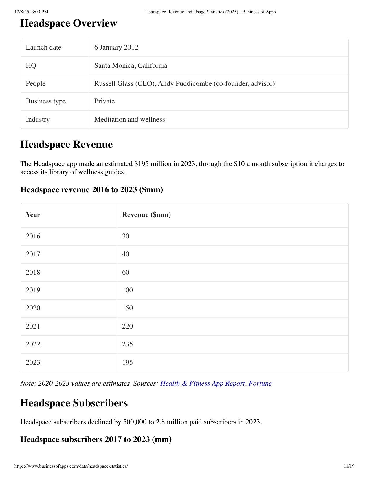
Shows: A simple data table of estimated Headspace annual revenue, from $30M (2016) rising to a peak of $235M (2022) before dipping to $195M (2023); a companion table (page 5, not separately saved) shows cumulative downloads growing from 6M (2016) to 80M (2023).
Why engaging: Note this PDF has **no rendered chart images** — pdfimages shows only a small logo — so this is a plain HTML table, not a graphic. Still flagged because the underlying numbers (steady revenue/download growth, illustrating the mainstreaming of consumer meditation apps) would make an easy, compelling custom bar/line chart for the explainer even though there's no existing figure to lift directly.
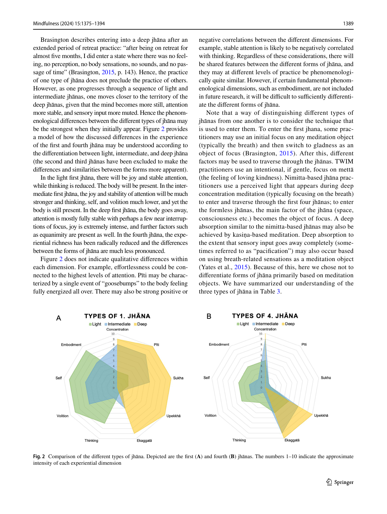
Shows: Two radar/spider charts comparing "light," "intermediate," and "deep" jhāna across dimensions like embodiment, self, concentration, and joy.
Why engaging: Radar charts are visually distinctive and instantly communicate "these are different flavors/intensities of the same experience" without needing statistics literacy.
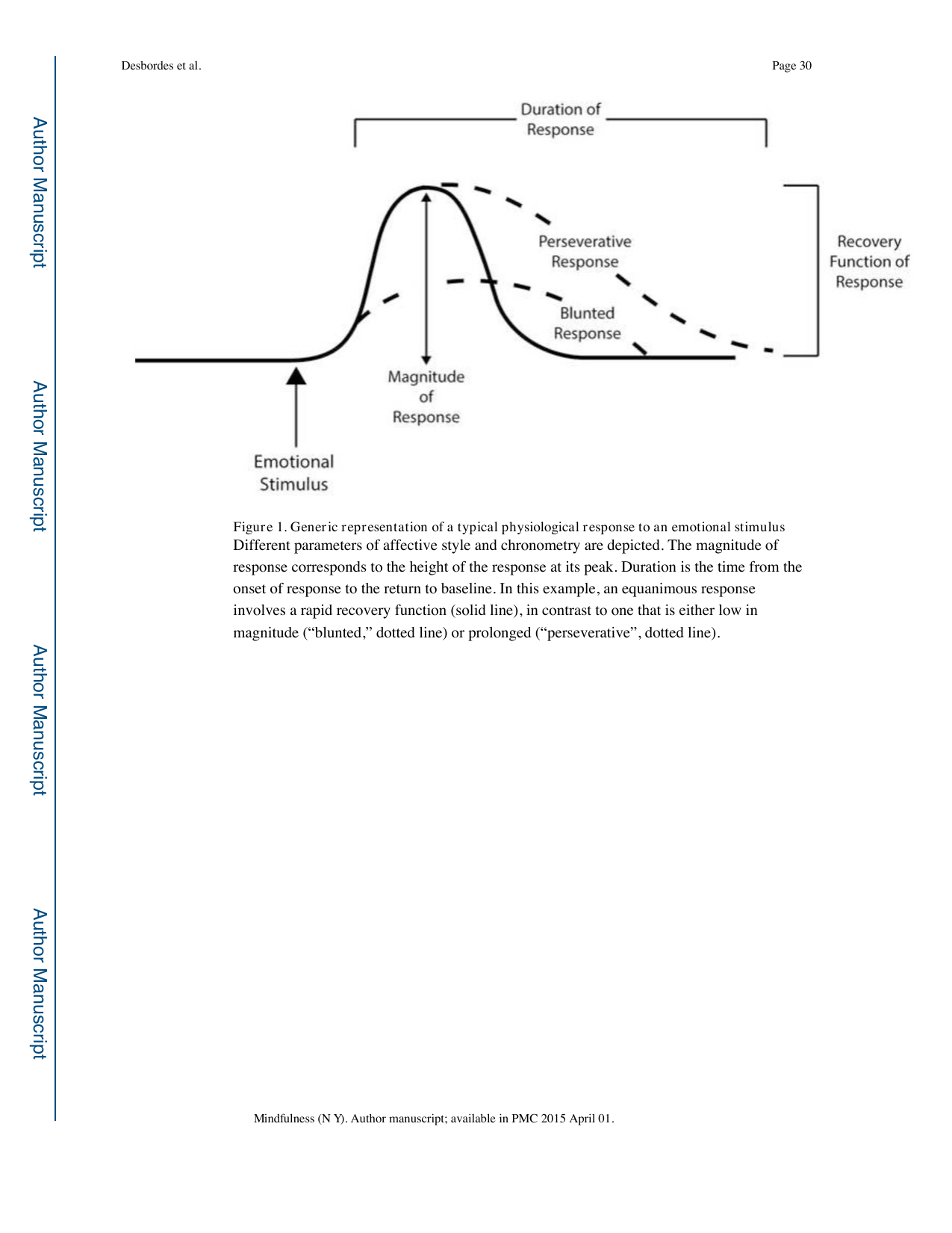
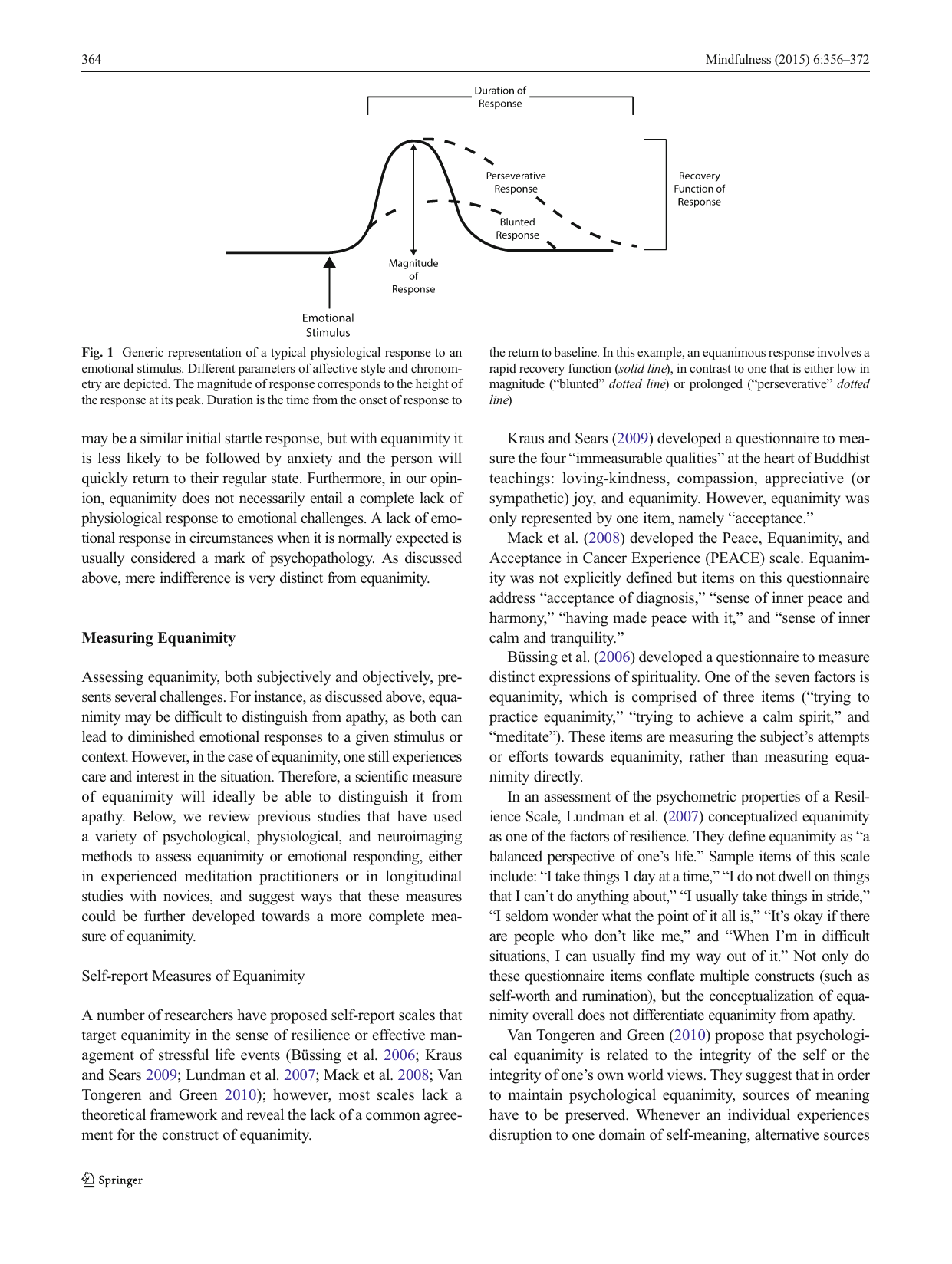
Shows: A conceptual curve diagram showing "magnitude" and "duration" of an emotional response, contrasting an equanimous/fast-recovery response against a "blunted" (too low) or "perseverative" (too prolonged) response.
Why engaging: A rare, genuinely elegant conceptual (non-data) diagram that visually explains what "equanimity" means as a curve shape — perfect for the equanimity/affective-style discussion.
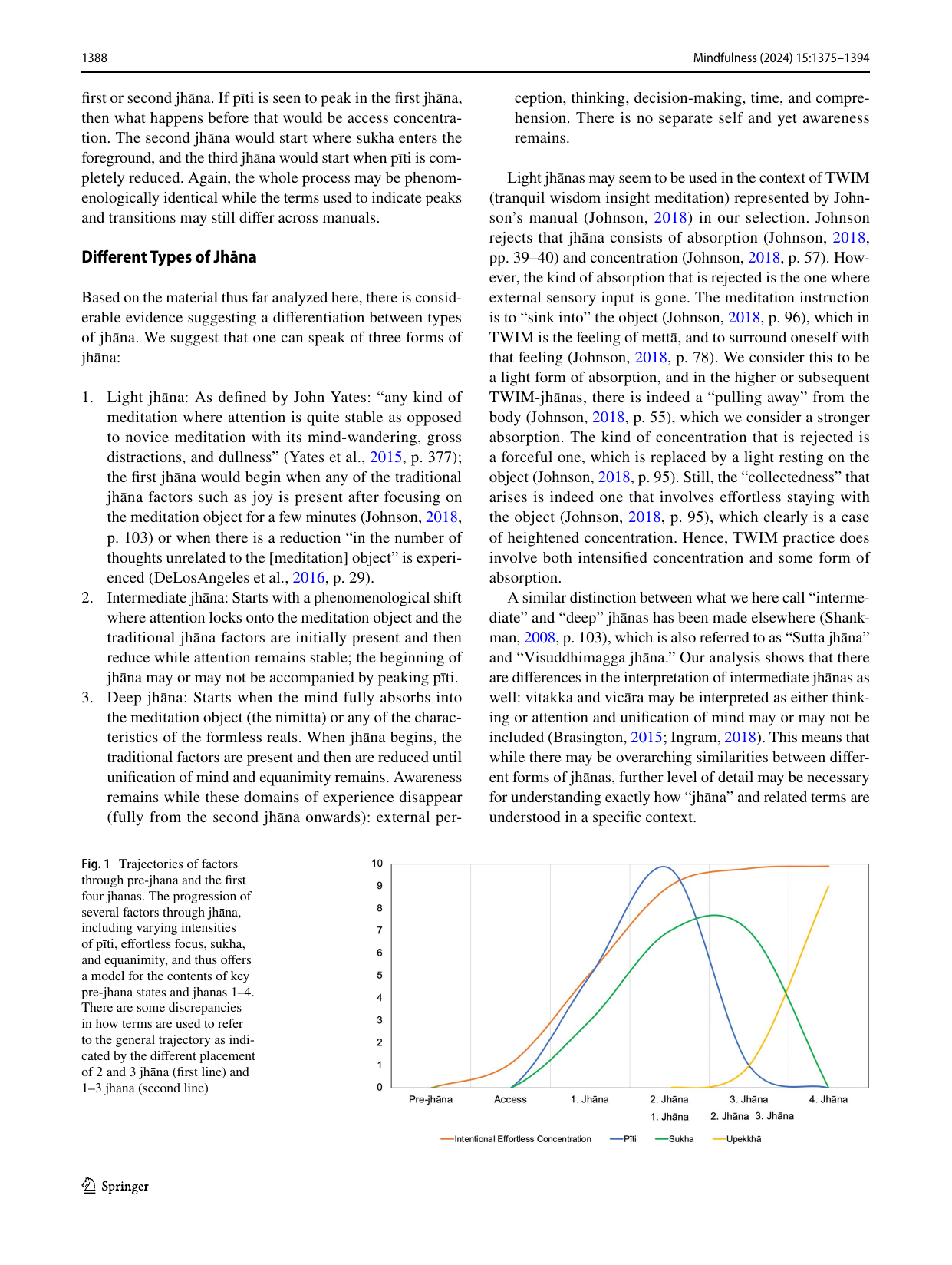
Shows: A colorful line chart tracking four experiential qualities (concentration, pīti/rapture, sukha/joy, equanimity) as they rise and fall across pre-jhāna and the first four jhāna stages.
Why engaging: A rare quantified, colorful visualization of subjective meditative stages — reads like a "mood curve" and makes an esoteric contemplative map feel like real data.
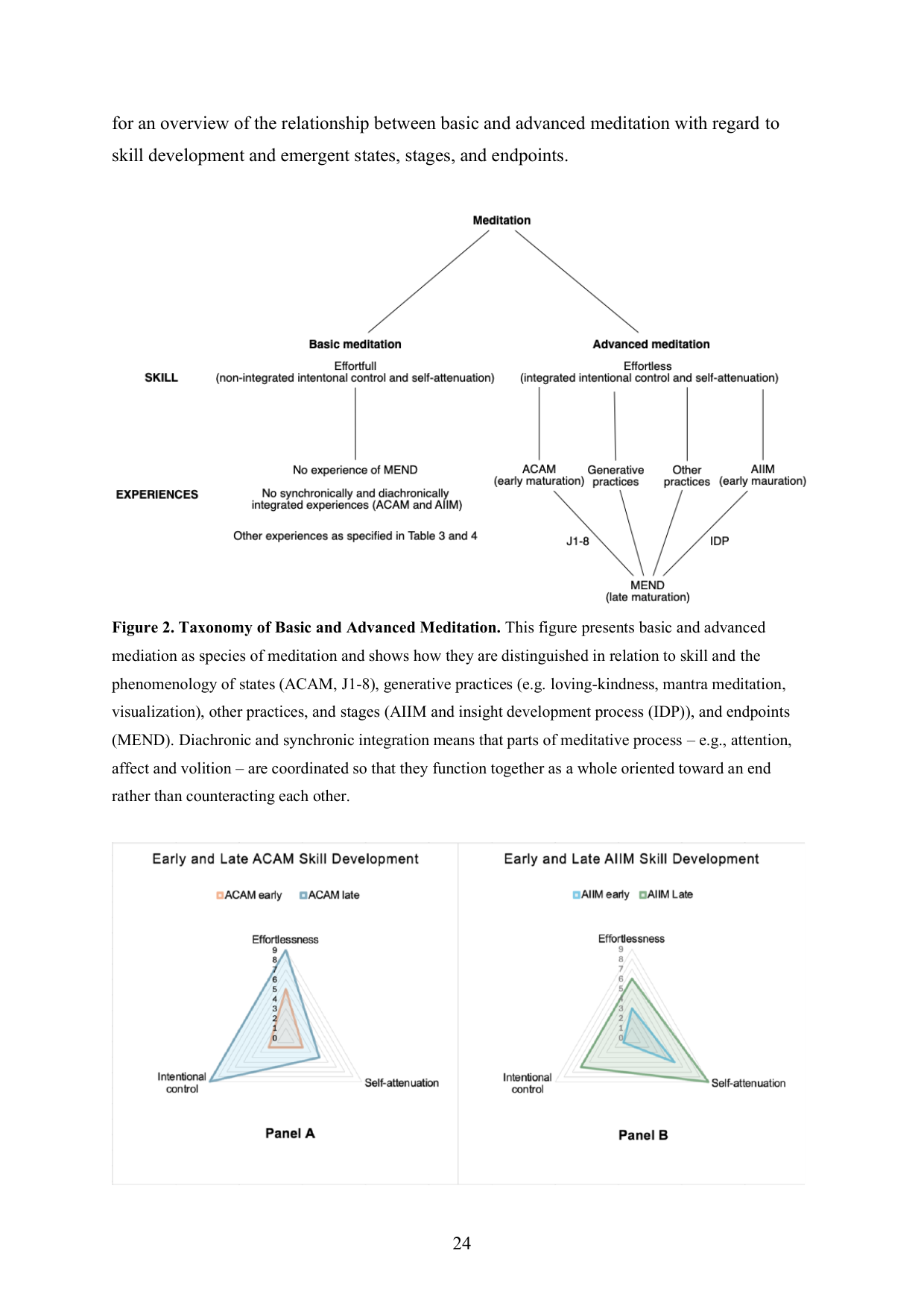
Shows: A clean branching tree diagram from "Meditation" down through "Basic" (effortful) vs. "Advanced" (effortless) branches to specific endpoint states (jhānas 1–8, insight stages).
Why engaging: Simple, uncluttered tree diagram — much cleaner than Figure 1 on the same theme, good as a schematic explainer of the basic-vs-advanced distinction.
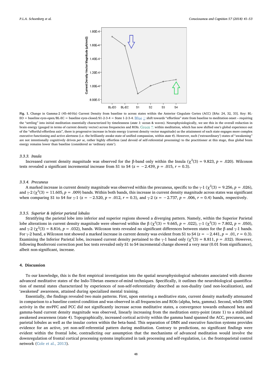
Shows: A simple line chart of EEG gamma-band "current density" (brain energy) in the anterior cingulate cortex, dropping sharply from baseline into meditation onset (blue arrow, "effortless" shift) then rising progressively across states 1–4 toward a stabilized "awakened"/unified-compassion state (green arrow).
Why engaging: Single clean line with only 6 data points and two annotated colored arrows telling a clear "settle down, then build up" story — much more digestible than the dense stats-heavy text around it, and visually supports the "advanced states involve a distinctive brain signature" narrative.
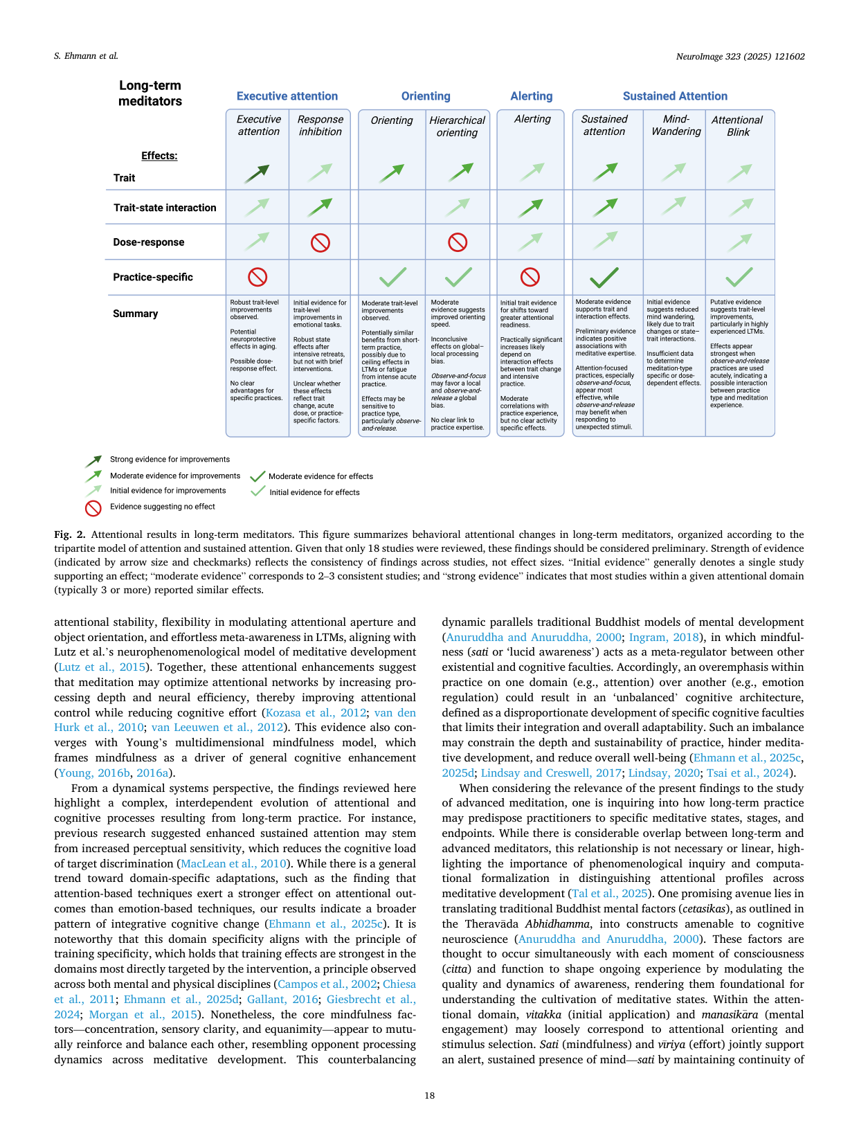
Shows: A summary table using arrow icons (strong/moderate/initial evidence) and checkmarks/no-entry symbols to show which attentional sub-domains (executive attention, orienting, alerting, sustained attention) show evidence of improvement in long-term meditators.
Why engaging: Uses an icon-based visual language (arrows of different sizes, checks, "no" symbols) rather than plain text, making a complex evidence summary skimmable at a glance.
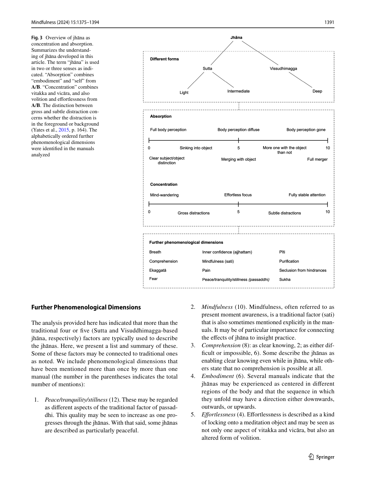
Shows: A classification tree plus labeled scales showing how "absorption" and "concentration" each range from ordinary experience to full merger/fully stable attention.
Why engaging: Useful as a reference diagram, but denser/more text-heavy than Figures 1–2 from the same paper.
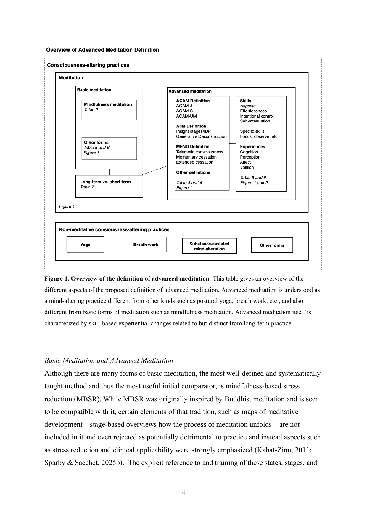
Shows: A nested-box diagram placing "advanced meditation" within meditation, within consciousness-altering practices generally, distinguishing it from basic/mindfulness meditation and from non-meditative practices (yoga, breathwork).
Why engaging: Gives visual structure to "what makes advanced meditation different," but is fairly dense with small text — best as a simplified redraw.
Shows: Two radar charts comparing "early" vs. "late" skill development on effortlessness, intentional control, and self-attenuation for two different meditation types (ACAM vs. AIIM).
Why engaging: Radar charts visually dramatize skill growth over practice — directly supports the "quality/skill, not just hours" argument in section 6.
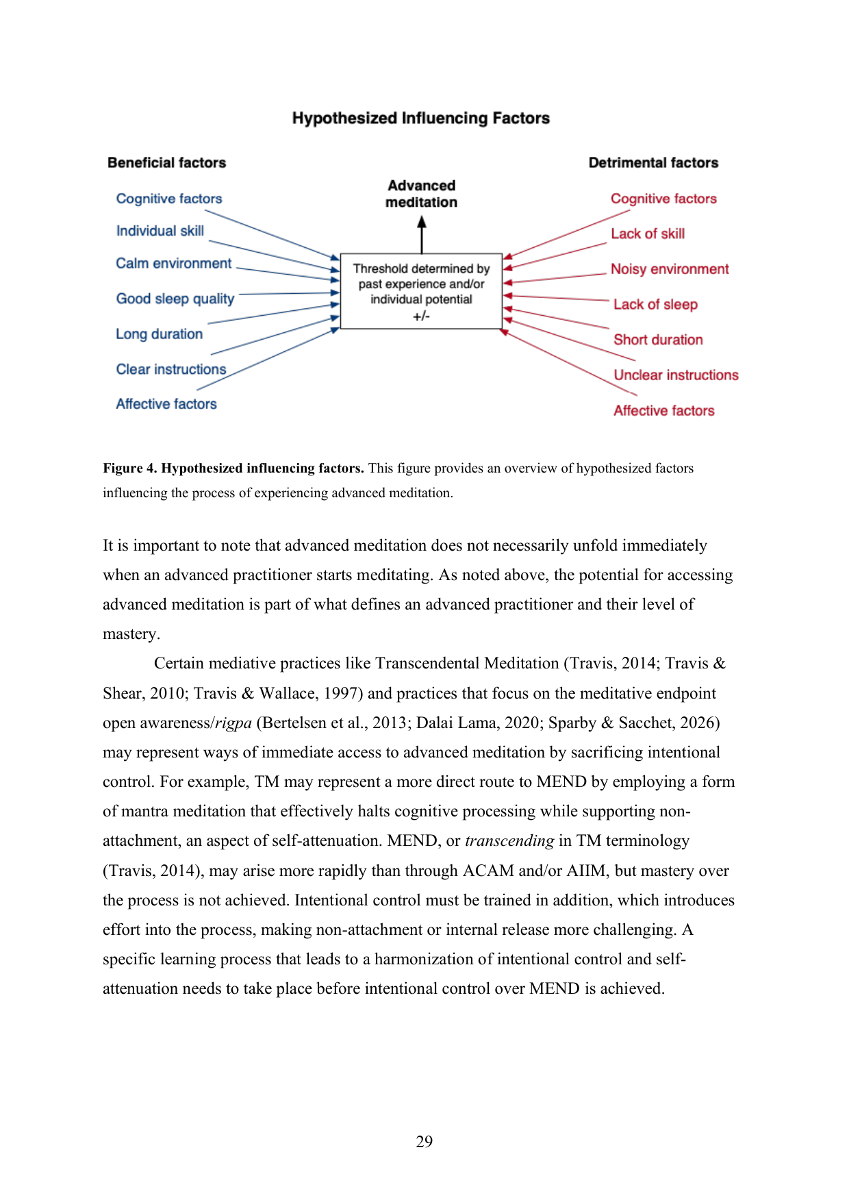
Shows: A clean two-sided arrow diagram: beneficial factors (skill, calm environment, sleep, long duration, clear instructions) vs. detrimental factors (lack of skill, noisy environment, poor sleep, short duration) feeding into a "threshold" for accessing advanced meditation.
Why engaging: Extremely clean, color-coded (blue = helps, red = hurts), and doubles nicely as a "how to actually get the most from your practice" checklist graphic.
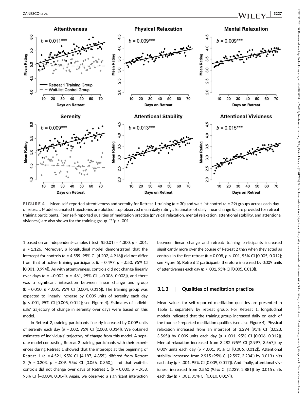
Shows: Six scatterplots-with-trend-lines showing steady day-by-day increases in attentiveness, physical/mental relaxation, serenity, attentional stability, and attentional vividness over ~70 days of retreat training (vs. flat wait-list controls).
Why engaging: Clean, consistent small-multiples chart design with an obvious "trained group goes up, control stays flat" story across six different outcome measures — very persuasive and easy to read at a glance.
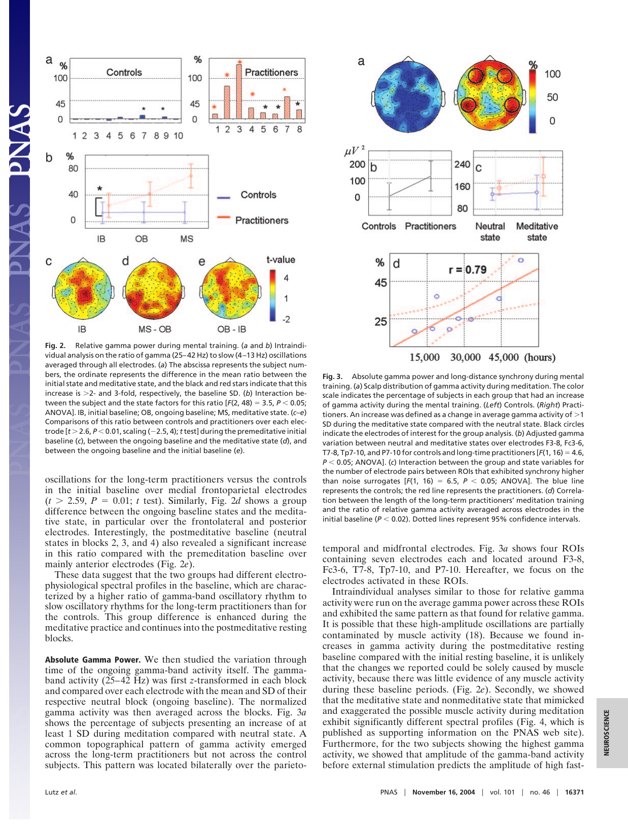
Shows: Colorful head-scalp topographic maps of gamma activity plus a scatter plot (r = 0.79) showing gamma synchrony rising with total hours of meditation practice (from ~15,000 to 45,000+ hours).
Why engaging: A rare, quantitative "dose-response" chart directly linking practice hours to a measurable brain-state change — an excellent visual for the "skill scales with practice, not just years" argument in section 6.
Shows: A simple generic curve of a physiological response to an emotional stimulus, showing an equanimous "fast recovery" response versus a "blunted" (too low) or "perseverative" (too prolonged) response.
Why engaging: Extremely clean, minimal line-drawing that visually defines "equanimity" in one glance — much easier to grasp than a paragraph of text, and reusable as a simple redrawn schematic.
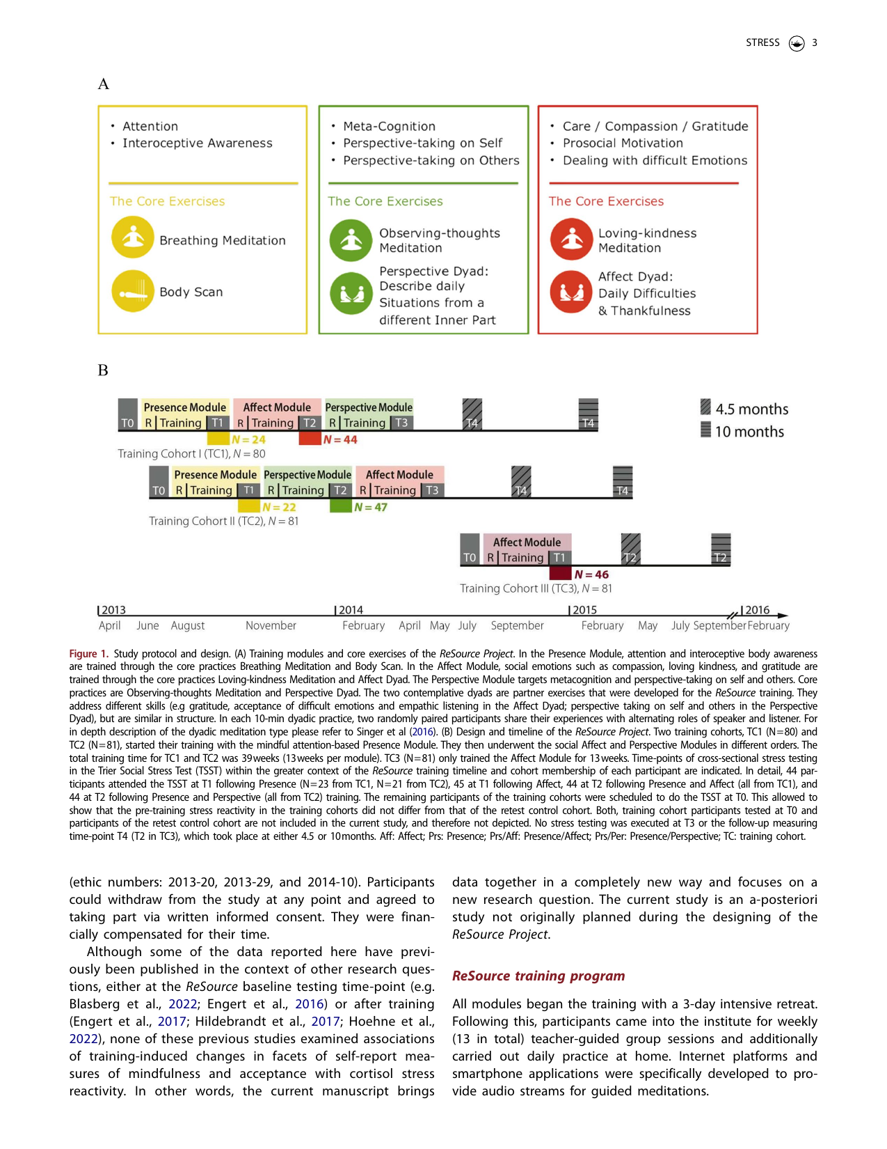
Shows: Panel A is a colorful three-box diagram (yellow/green/red) showing the three ReSource training modules — Presence (attention/interoceptive awareness), Perspective (meta-cognition), and Affect (compassion/care) — each with icons for their core meditation exercises (breathing meditation, body scan, observing-thoughts, loving-kindness, etc). Panel B is a cohort/timeline schematic of the study design.
Why engaging: Panel A is genuinely well-designed — colorful icons, parallel structure across three practice "families," directly visualizes the strength/cardio/flexibility-style analogy the course already wants to make for meditation skill families.
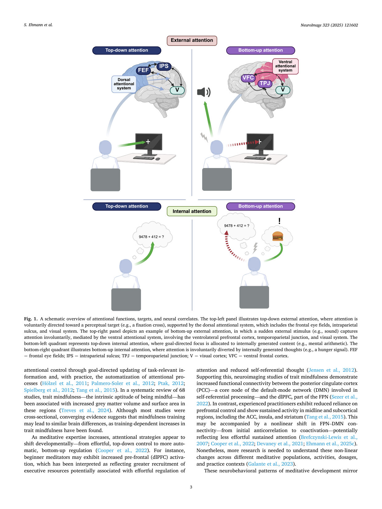
Shows: A four-quadrant illustrated diagram contrasting top-down vs. bottom-up, and external vs. internal attention, using simple cartoon figures (person at a computer, a distracting hunger thought) and brain diagrams.
Why engaging: Genuinely illustrator-quality schematic with friendly cartoon vignettes — far more engaging than a typical academic figure, and does a great job explaining "attention" concretely.
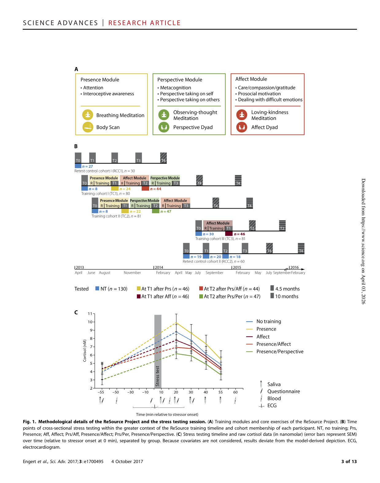
Shows: Panel A shows the three ReSource training modules (Presence/Attention, Perspective, Affect/Loving-kindness) with their component practices; panel C is a color-coded line chart of raw cortisol levels over time around a stress test, split by training group.
Why engaging: Panel A is a near-perfect visual match for the "three skill families" framework (Attentional/Constructive/Deconstructive) the course already teaches, and panel C is a clean, legible stress-response line chart — a strong candidate to crop/simplify.
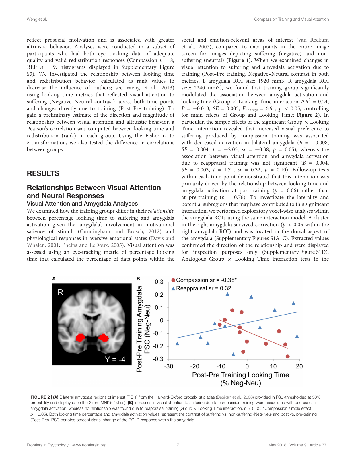
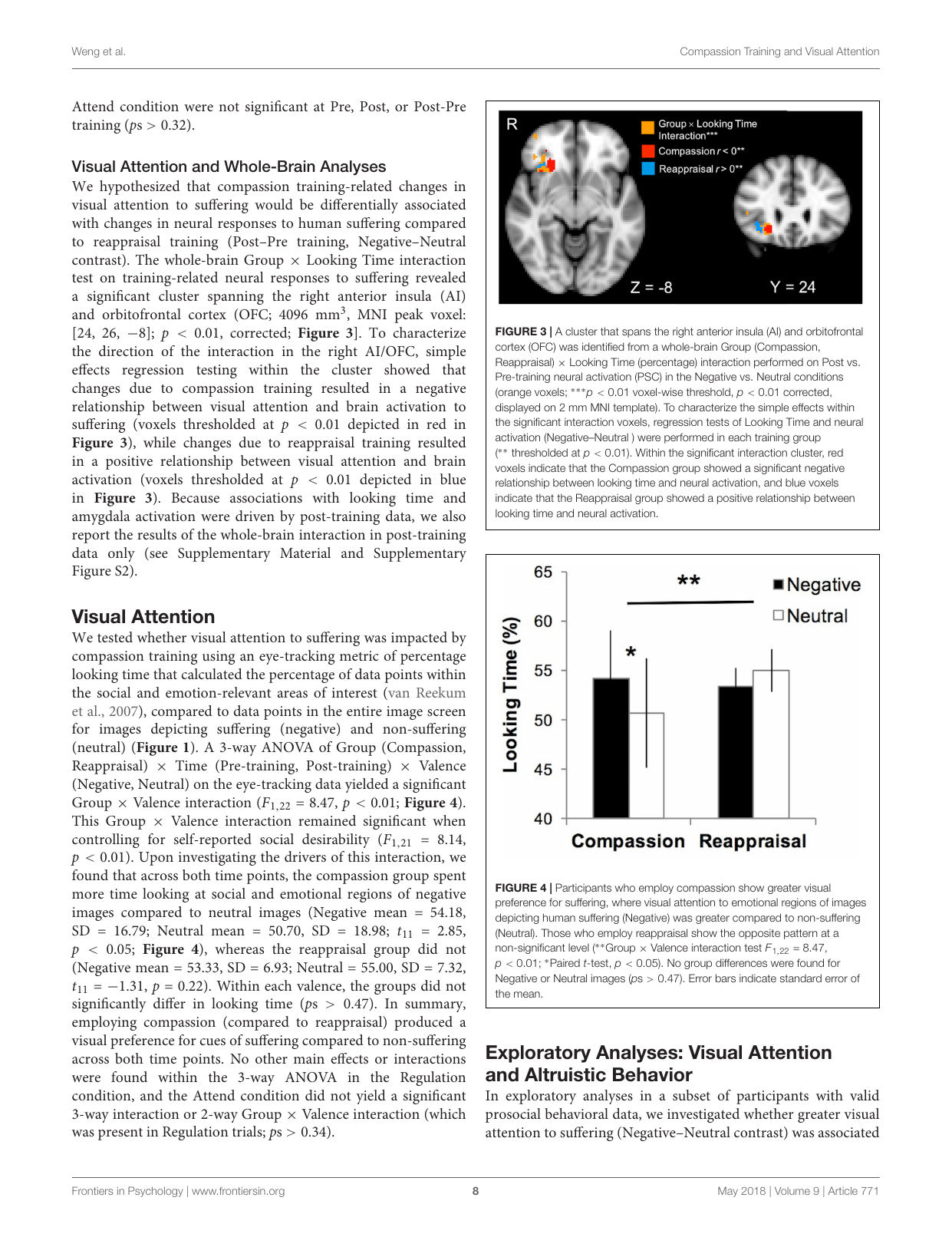
Shows: A brain scan with the amygdala highlighted in red, next to a scatterplot showing that increased attention to suffering was linked to *decreased* amygdala activation after compassion training (opposite pattern after reappraisal training).
Why engaging: Combines an easily recognizable brain-scan image with a clean scatter plot showing two diverging trend lines — visually and conceptually clear contrast between two types of training.
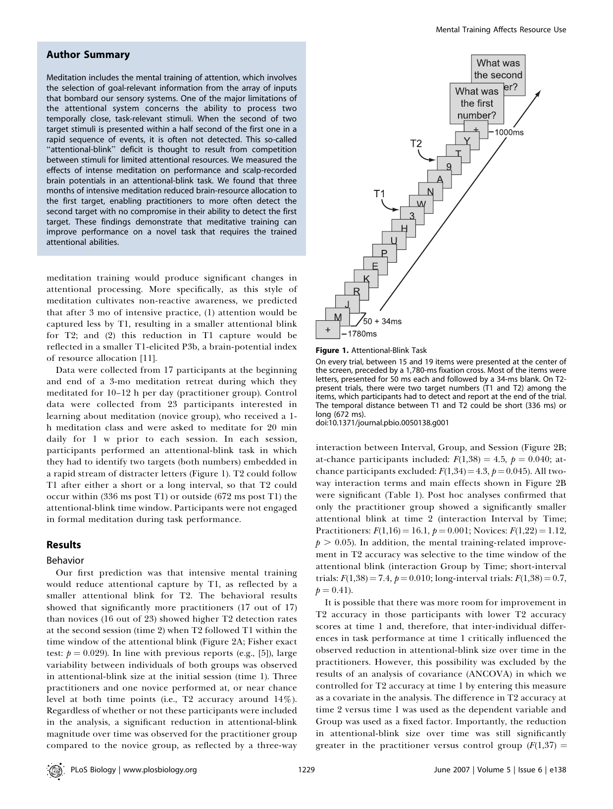
Shows: A step-by-step schematic of the "attentional blink" task — a rapid stream of letters flashing on screen with two hidden target numbers (T1, T2) participants must spot.
Why engaging: Immediately makes an abstract cognitive-psychology paradigm intuitive — you can see exactly what participants experienced, which sets up the surprising finding (meditators got better at catching the second target).
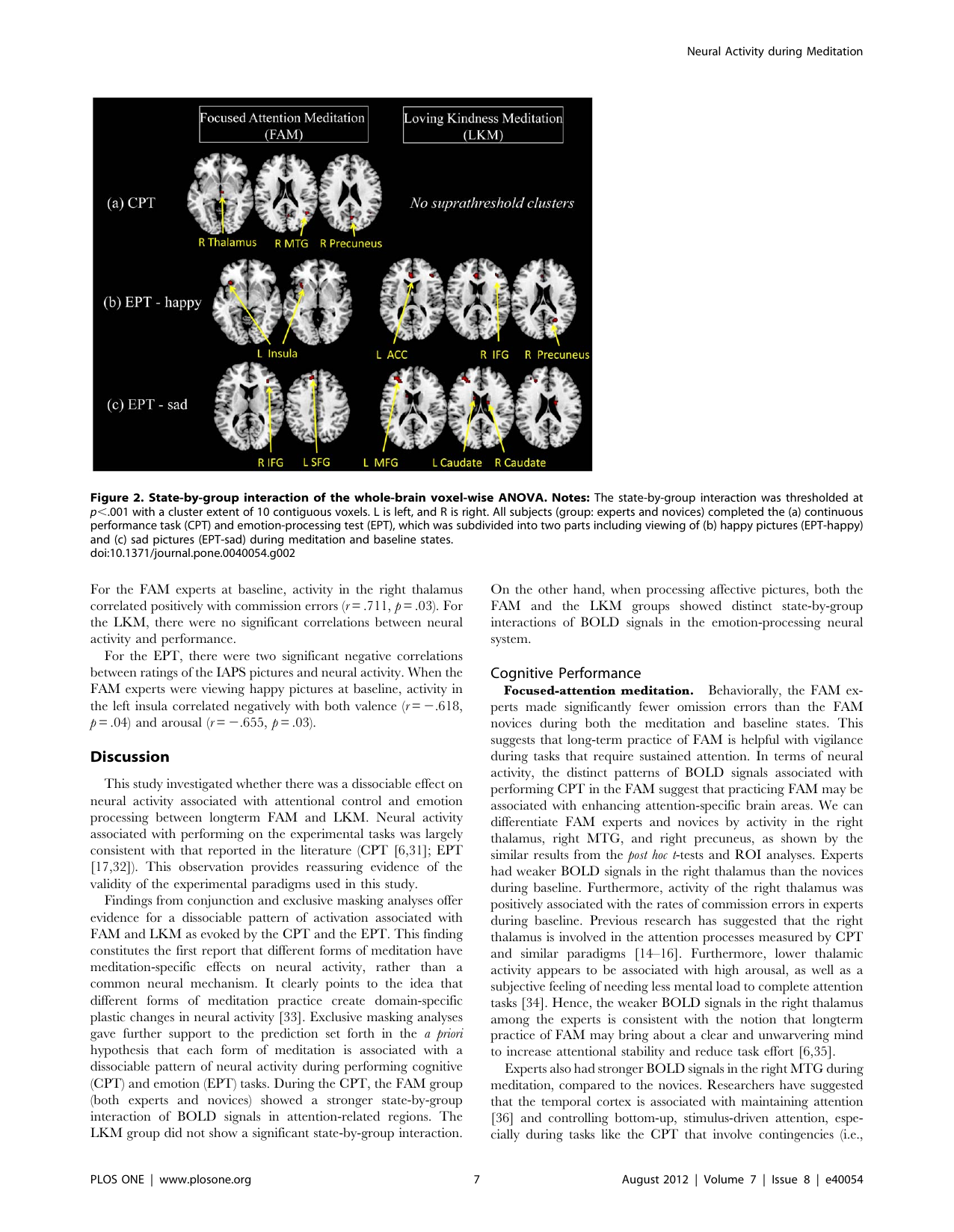
Shows: Labeled brain slices showing that focused-attention meditation (FAM) and loving-kindness meditation (LKM) activate clearly different, non-overlapping brain regions during attention and emotion tasks.
Why engaging: Clean, clearly labeled (yellow arrows + region names) brain images that directly visualize the course's core claim that "meditation is not one skill" — different practices train different neural systems.
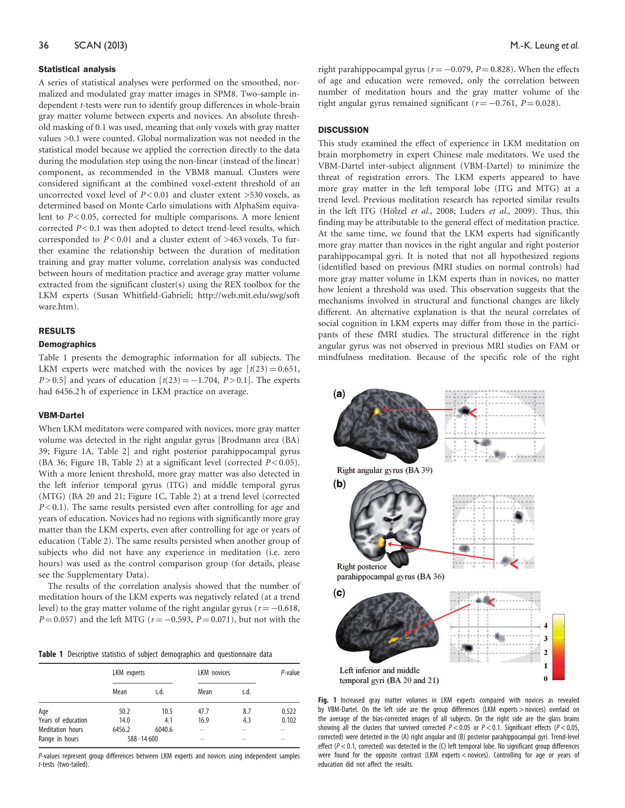
Shows: Three brain-surface renderings with red arrows pointing to regions (right angular gyrus, posterior parahippocampal gyrus, temporal lobe) where long-term loving-kindness meditators have measurably more gray matter than novices.
Why engaging: Visually clean 3D brain renders with a "glass brain" inset and clear region labels — an ideal illustration that meditation training measurably reshapes the brain, tied directly to the constructive/warmth skill family.
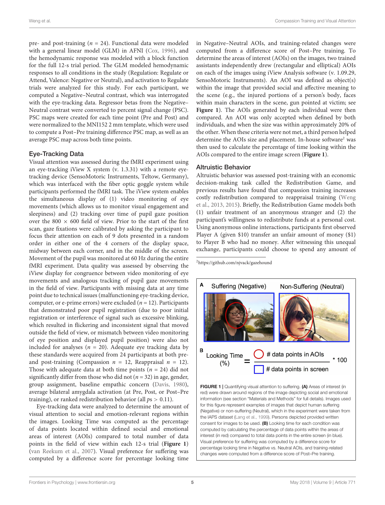
Shows: Two real photographs (a suffering vs. non-suffering person) with red ovals marking "areas of interest," plus a simple formula for computing % looking time.
Why engaging: Uses real human photos and a dead-simple formula — extremely intuitive way to show how eye-tracking quantifies "visual attention to suffering," no stats background needed.
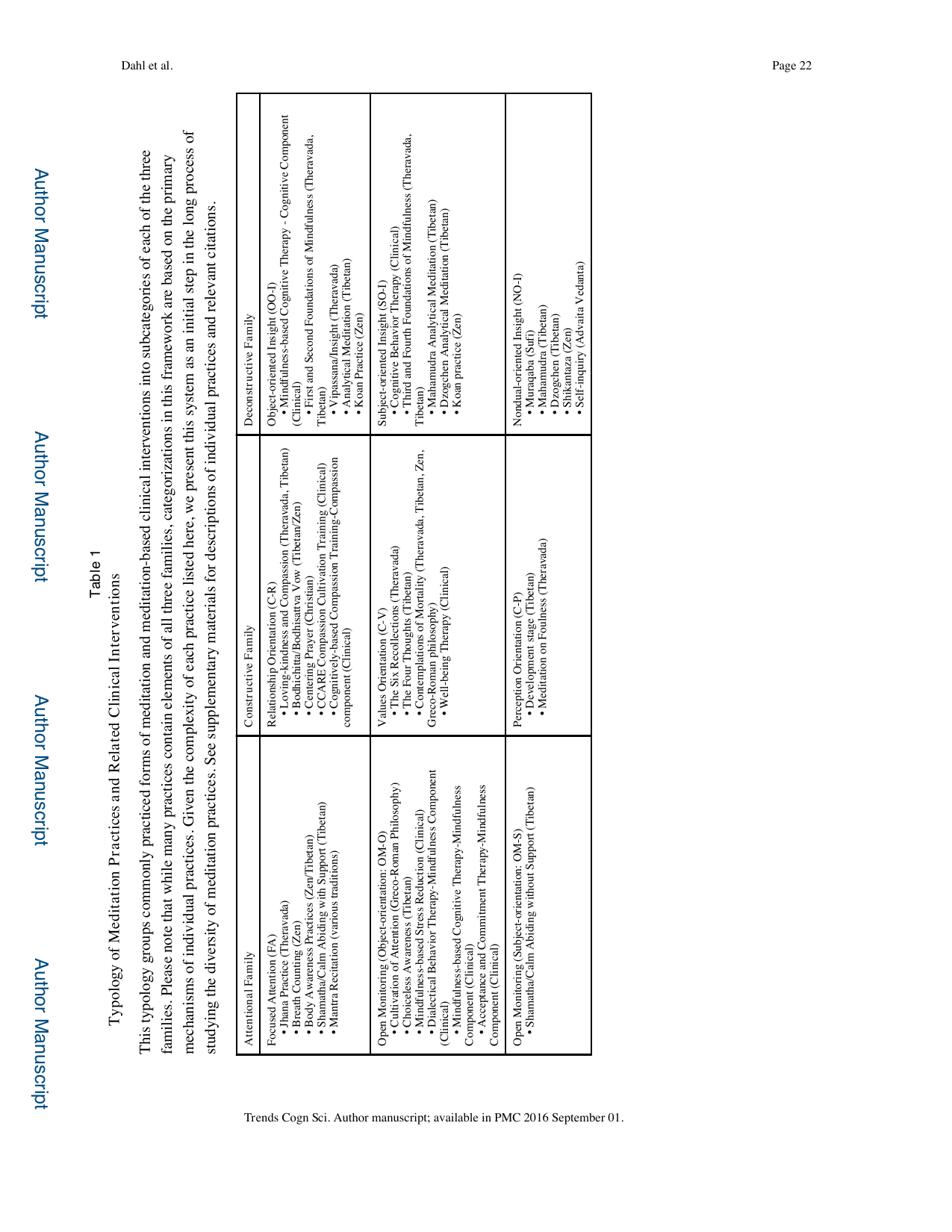
Shows: A table mapping the three meditation "families" (Attentional, Constructive, Deconstructive) to their subcategories and example practices (e.g., focused attention, open monitoring, compassion, insight).
Why engaging: This is the literal source table for the course's own "three skill families" framework — could be redesigned as a clean three-column infographic instead of a wall of text.
Shows: A three-circle Venn-style diagram (Presence / Perspective / Affect) with each circle's target skills and its two core practice exercises (e.g., breathing meditation & body scan for Presence; loving-kindness meditation & affect dyad for Affect) with small icons.
Why engaging: A near-perfect visual analogy for the Dahl et al. 2015 Attentional/Constructive/Deconstructive taxonomy in the course outline — colorful, uses icons, and directly supports the "meditation is a family of distinct trainable skills" argument.
Shows: A colorful brain-scan overlay (orange/red/blue voxel clusters) showing where compassion vs. reappraisal training differentially changed brain responses to suffering.
Why engaging: Striking, colorful neuroimaging visual — reads as "hard science" evidence for compassion training's brain effects.
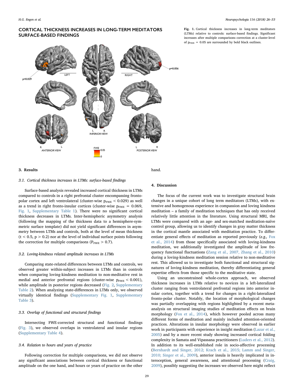
Shows: Six-view brain renderings (lateral, medial, inferior, anterior, posterior) highlighting regions of increased cortical thickness in long-term loving-kindness/compassion meditators vs. controls.
Why engaging: Clean, colorful, multi-angle brain surface maps — visually striking and immediately reads as "meditation changed brain structure here."
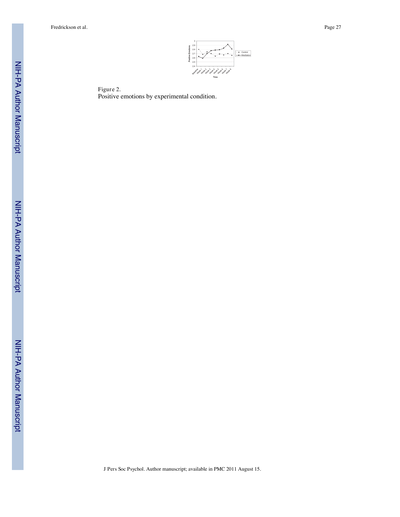
Shows: A simple line chart of self-reported positive emotions over 9 weeks, rising steadily in the loving-kindness meditation group relative to a flat control group.
Why engaging: Small in the original PDF but a genuinely clean "line going up" chart that visually proves the "meditation builds positive emotion over time" claim — easy to redraw larger/cleaner.
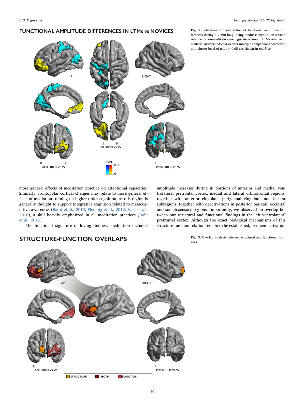
Shows: Two more sets of six-view brain renderings: functional amplitude differences during loving-kindness meditation vs. rest, and the overlap between structural and functional findings.
Why engaging: Same clean brain-rendering style as Fig. 1; the color-coded "structure/both/function" overlap legend at the bottom is a nice touch. Slightly more complex than Fig. 1 so offered as an alternate/supplement.
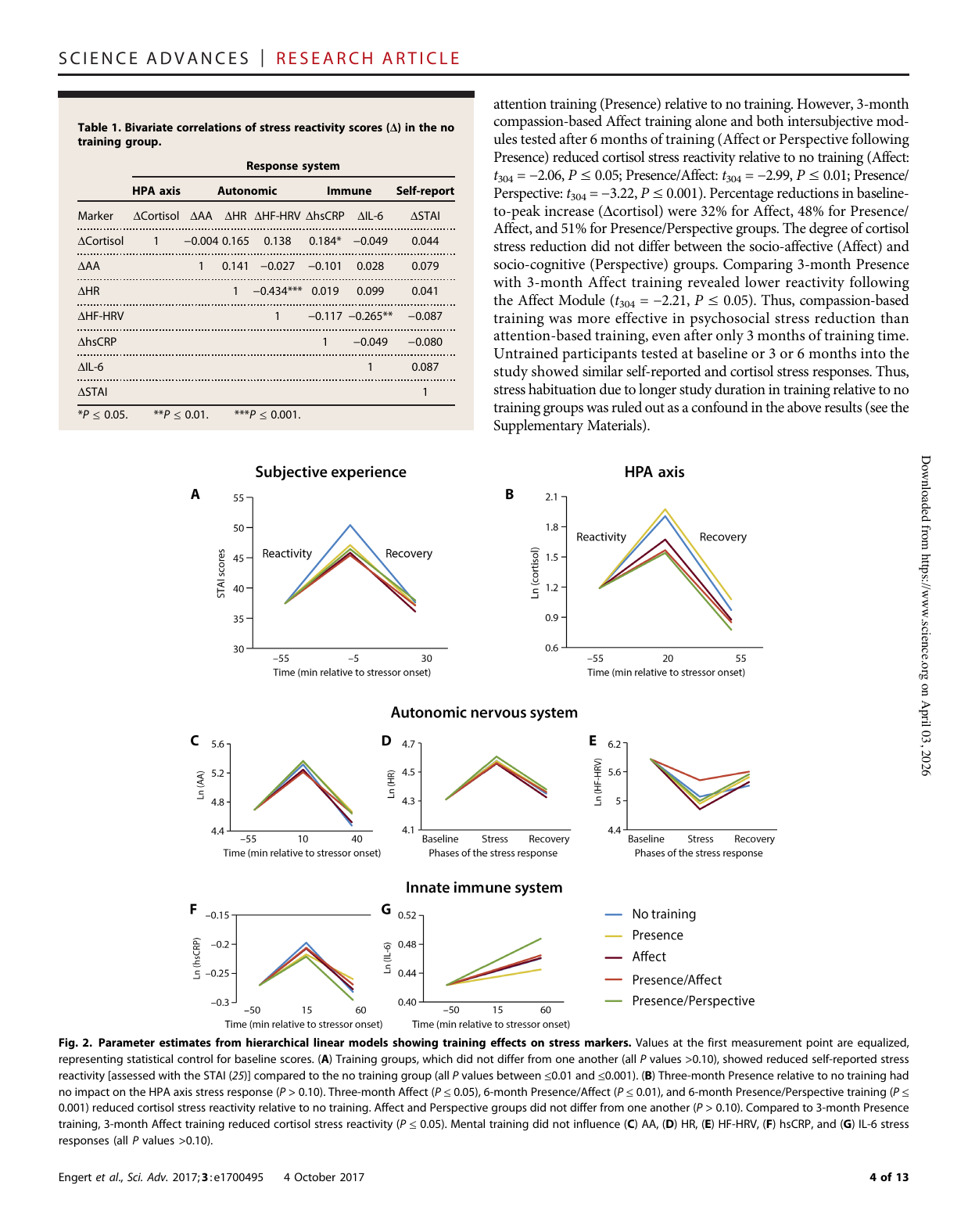
Shows: Seven small multiples (subjective stress, cortisol, and other physiological markers) each showing reactivity/recovery curves color-coded by training group (No training / Presence / Affect / Presence+Affect / Presence+Perspective).
Why engaging: Consistent color-coding across all 7 panels makes it easy to track how compassion-based (Affect) training outperforms attention-only training on stress recovery — good supporting/alternate chart to the Fig. 1 cortisol panel, though busier with 7 panels.
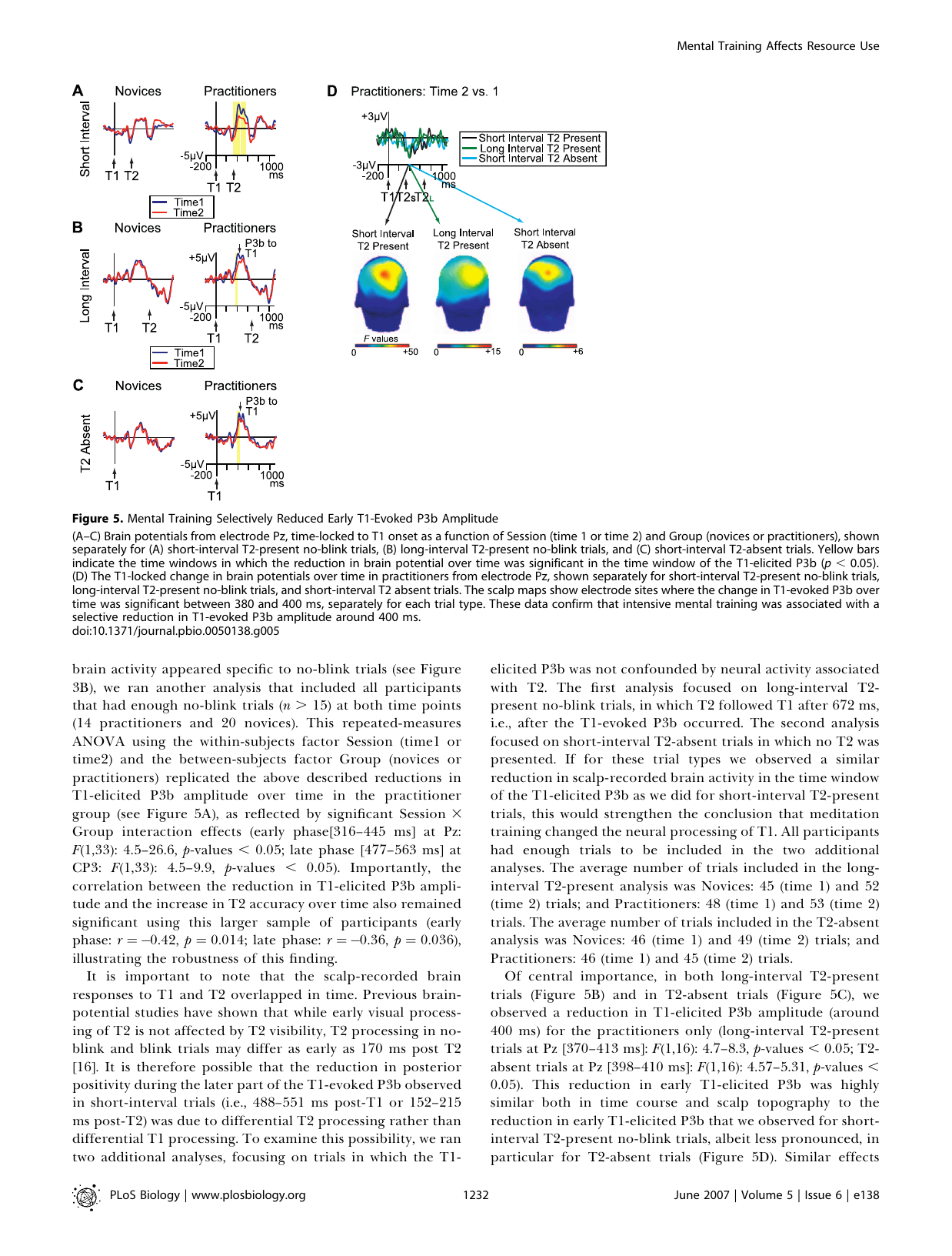
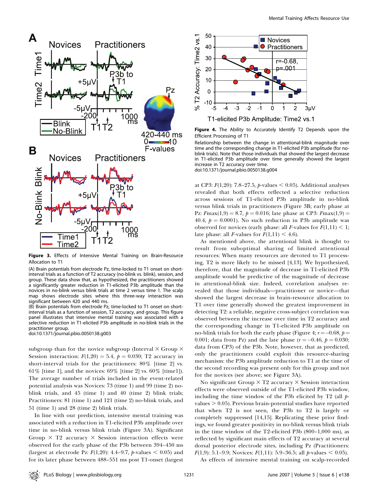
Shows: Brain-wave (ERP) traces at electrode Pz plus small colorful scalp heat-maps showing where/when brain activity to the first target dropped after training.
Why engaging: The colorful head-shaped heat maps (panel D) are visually striking and instantly read as "brain science," even without following every statistic.
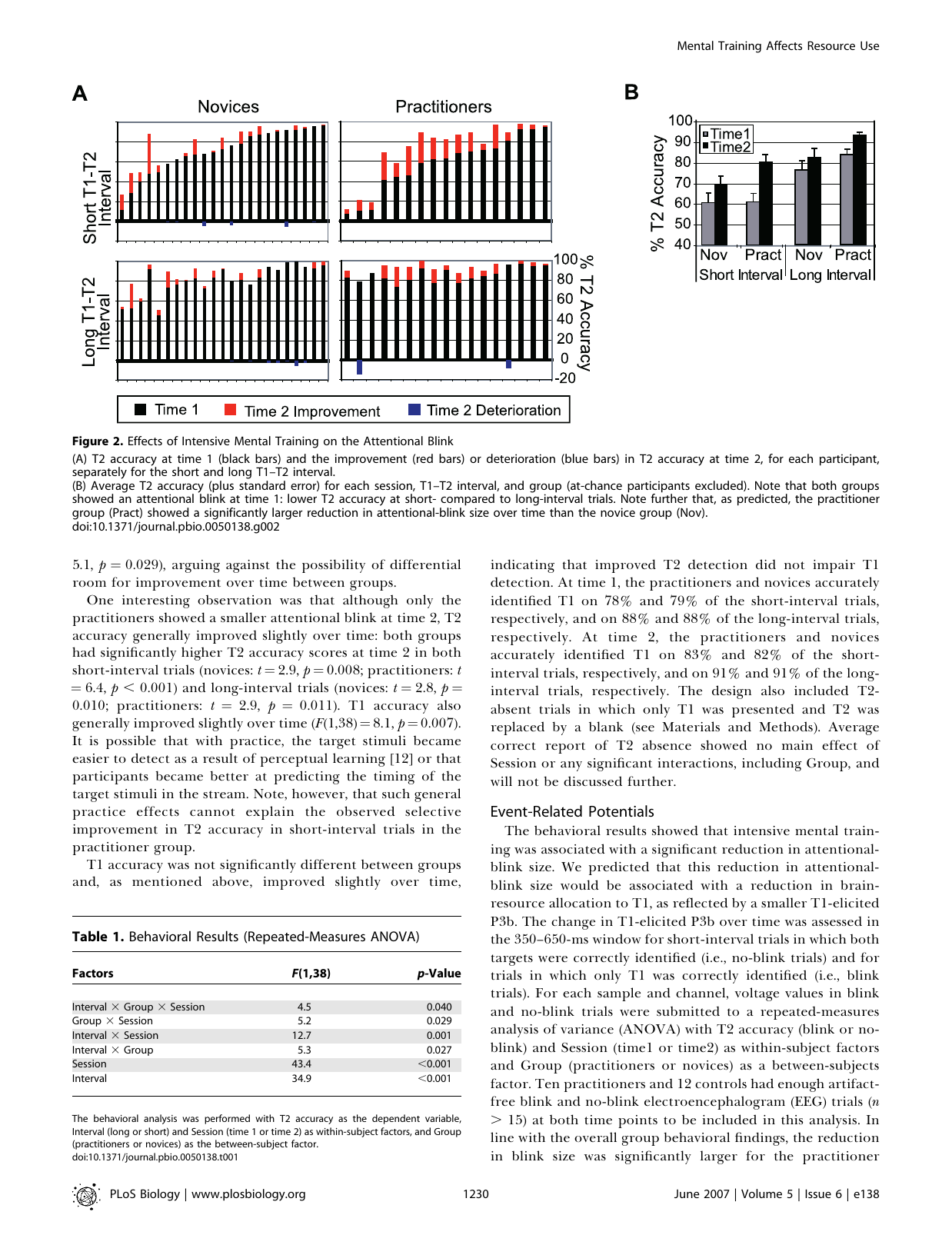
Shows: Bar charts comparing T2-detection accuracy in meditators vs. novices before and after a 3-month retreat; panel B is a clean grouped bar chart of average accuracy by group/session.
Why engaging: Panel B alone is a simple, legible "before/after, trained vs. control" bar chart — good evidence that meditation training improved a measurable skill.
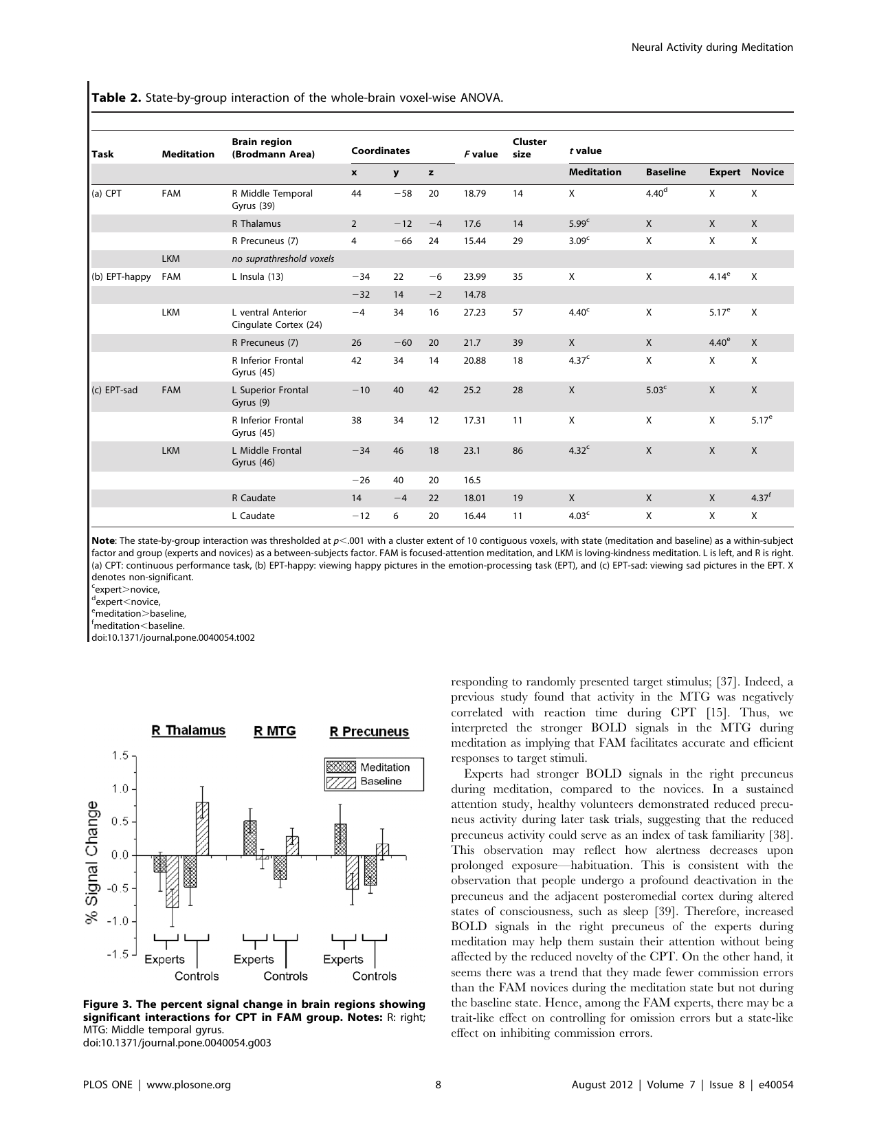
Shows: A grouped bar chart of percent BOLD signal change (meditation vs. baseline) in three brain regions, comparing FAM experts vs. novices.
Why engaging: A secondary, more quantitative companion to the brain-slice figure above; useful if a bar-chart format is preferred, but more cluttered (multiple groups + error bars).
Shows: A simple bar chart showing compassion-trained participants looked longer at suffering (vs. neutral) images, while reappraisal-trained participants showed the opposite trend.
Why engaging: Straightforward black/white bar chart with significance stars — easy secondary visual to pair with Figure 1.
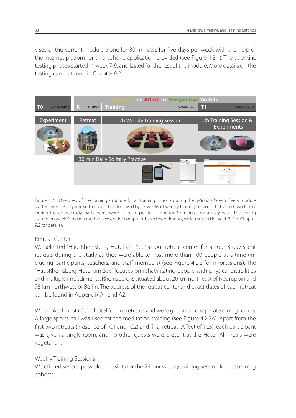
Shows: A timeline/infographic combining schedule blocks (retreat, weekly sessions, daily solo practice) with actual photos of the meditation hall, retreat house, and MRI scanner.
Why engaging: Real photographs mixed with a clean schedule bar make the abstract "training protocol" concept feel tangible and concrete — good "what does a real research-grade meditation training program actually look like" visual.
Shows: A clean scatterplot (right column) showing that people whose brain response to the first target dropped the most also improved the most at catching the second target.
Why engaging: Simple correlation scatter with a clear negative trend line — easy to read as "less brain resource wasted on target 1 = better at catching target 2."
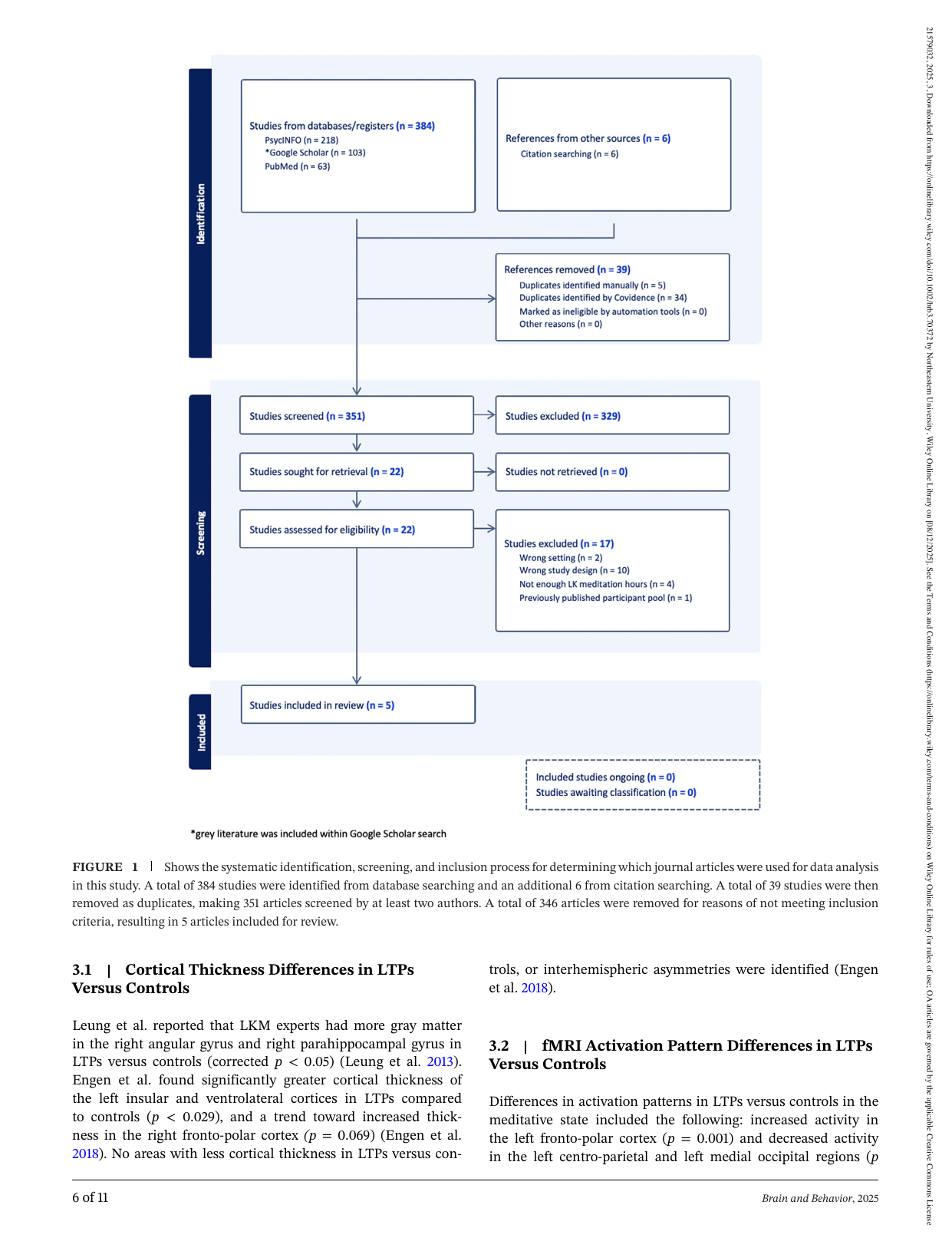
Shows: Standard PRISMA systematic-review flow diagram narrowing 384 identified studies down to 5 included studies on long-term loving-kindness meditators' brain structure/function.
Why engaging: Confirms there's a small but real evidence base specifically on loving-kindness/compassion training and brain changes; visually it's a generic PRISMA chart.
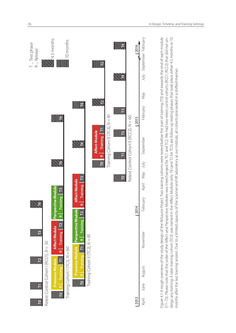
Shows: A Gantt-chart-style timeline showing three training cohorts moving through Presence/Affect/Perspective modules and retest-control cohorts, spanning 2013–2016.
Why engaging: Conveys the sheer scale and rigor of this kind of longitudinal meditation research (hundreds of participants, years of tracking), but is dense/technical as rendered.
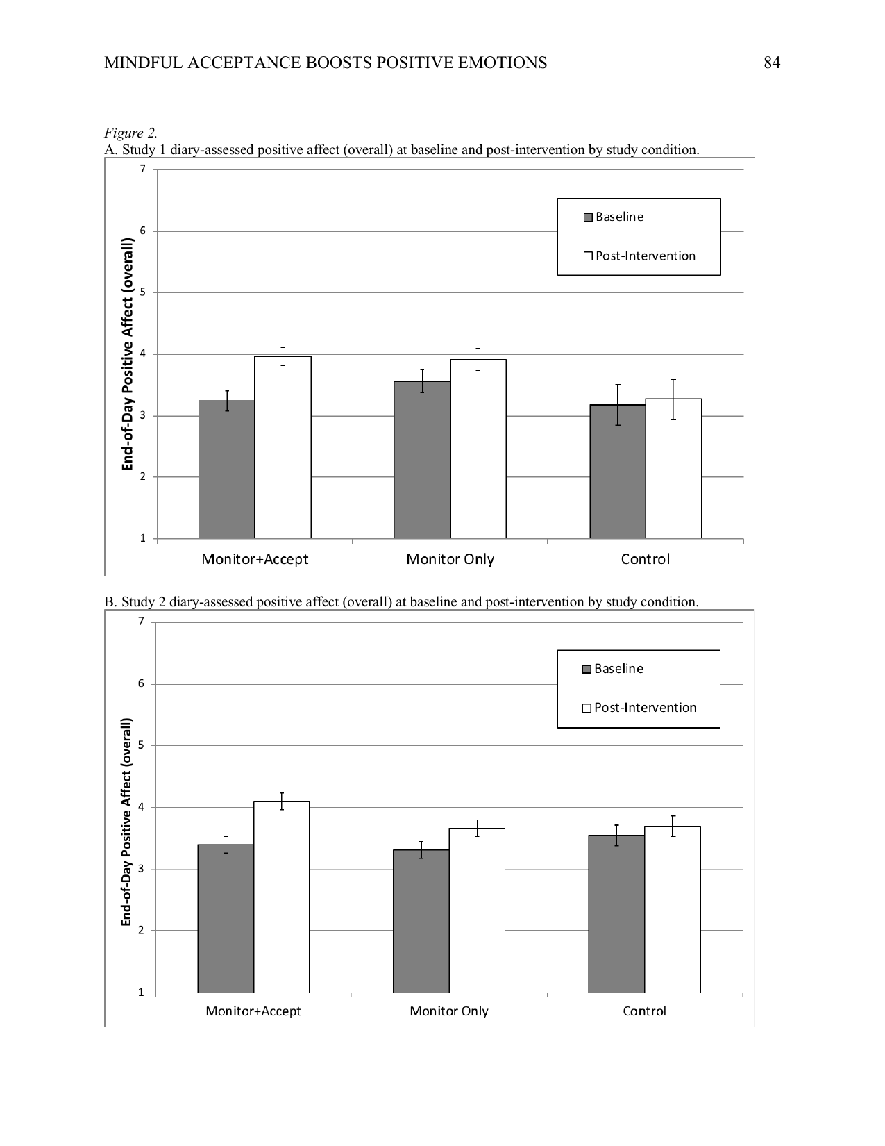
Shows: Two bar-chart panels (Study 1 and Study 2) showing that only the Monitor+Accept training condition produced a clear increase in end-of-day positive affect, compared to Monitor Only or Control.
Why engaging: Simple, clean grouped bar chart with an easy "only acceptance training moved the needle" story — a natural complement to the already-used cortisol chart from the sister paper, without duplicating it.
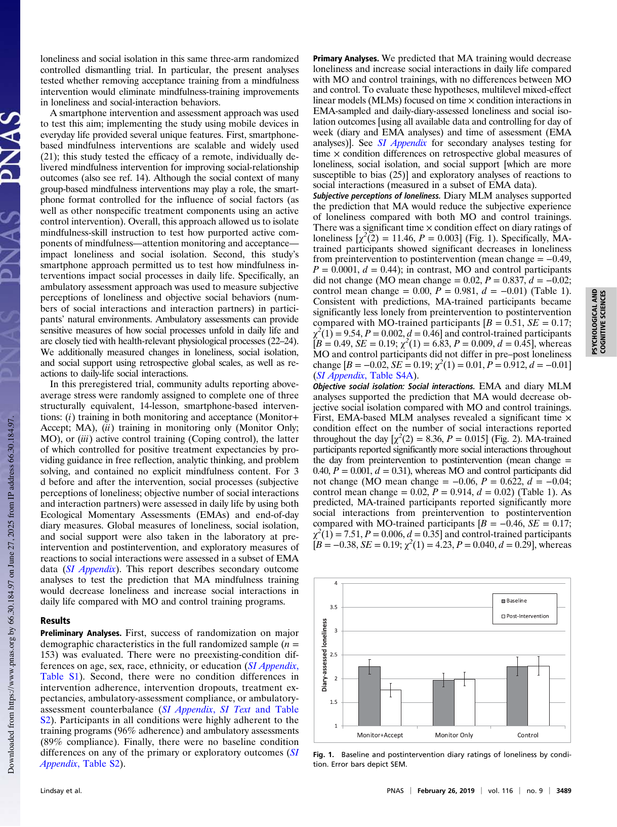
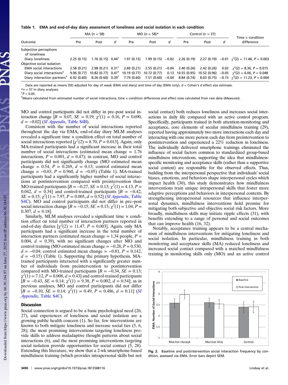
Shows: A bar chart showing diary-assessed loneliness dropping only in the Monitor+Accept training group, with no change in Monitor Only or Control groups.
Why engaging: A simple, emotionally resonant outcome (loneliness) with a clean bar-chart visualization — easy to read and ties mindfulness training to a widely-relatable social/health concern.
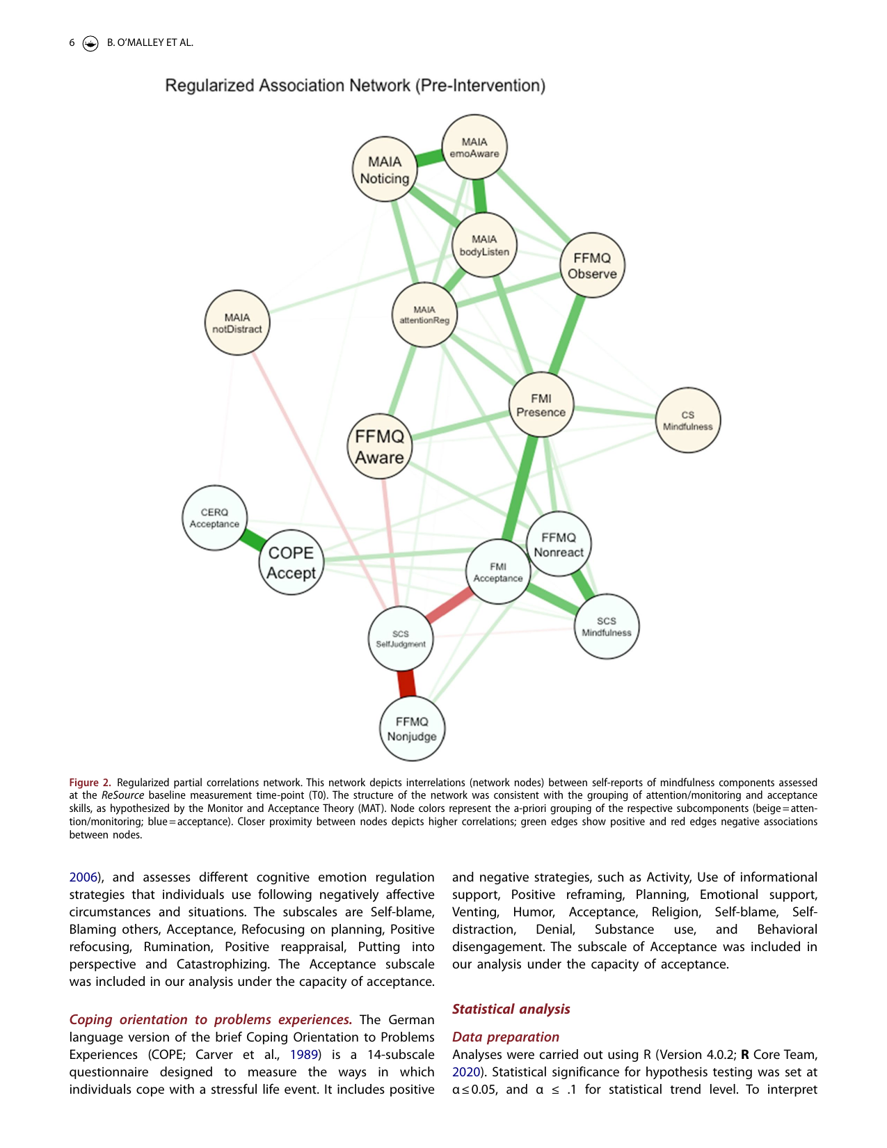
Shows: A colorful network/graph diagram where circles (self-report mindfulness subscales like "FMI Presence," "FFMQ Nonjudge," "COPE Accept") cluster into two color groups — beige for attention/monitoring, blue for acceptance — connected by green (positive) or red (negative) correlation lines.
Why engaging: Visually distinctive (not a bar chart or table) — the two-color clustering makes the abstract "monitoring vs. acceptance are separable skills" claim visually obvious at a glance.
Shows: A companion bar chart showing increased daily social-interaction frequency specifically in the Monitor+Accept group.
Why engaging: Same clean style as the loneliness chart; included as a secondary/alternative option rather than a must-use (very similar structure/message to the primary loneliness chart).
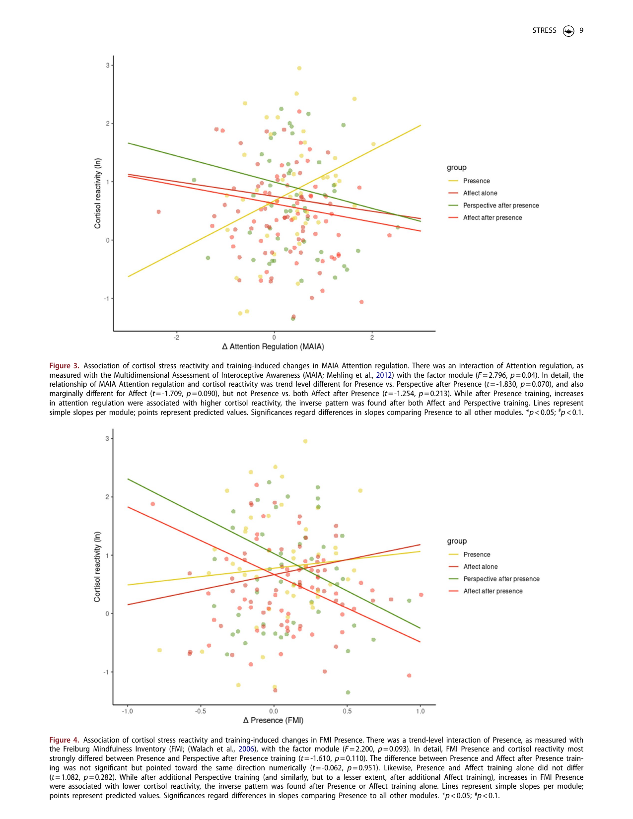
Shows: Scatter plot with four colored regression lines showing that after Presence (attention-only) training, increases in attention regulation are associated with HIGHER cortisol stress reactivity, while after Affect/Perspective training the relationship reverses (lower reactivity).
Why engaging: Directly visualizes the "monitoring without acceptance can backfire" narrative point with real data — but the underlying scatter is fairly noisy/busy, so it would need cleanup (or a simplified re-plot of just the four lines) to be truly explainer-ready.
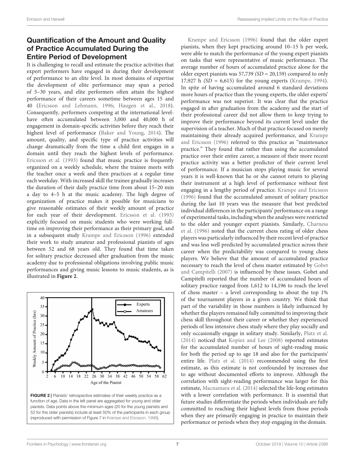
Shows: A line graph of pianists' estimated weekly practice hours as a function of age, contrasting experts (rising to ~30+ hrs/week) against amateurs (flat, under 5 hrs/week).
Why engaging: Classic, legible "hours invested over time" chart that visually makes the deliberate-practice point better than any text description — directly usable.
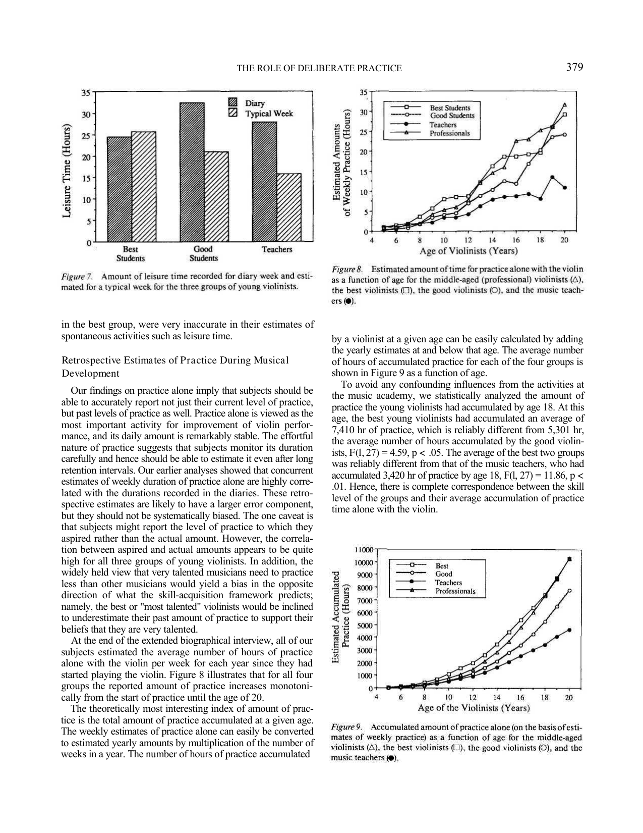
Shows: Two related charts — Figure 8 (estimated weekly practice hours by age for best/good violinists, teachers, and professionals) and Figure 9 (the iconic cumulative/accumulated practice-hours curve converging near 10,000 hours by age 20 for the best violinists).
Why engaging: This is the single most famous figure underlying the "10,000-hour rule" popularization — a must-have visual anchor for the deliberate-practice section, clean and legible even in the original 1993 style.
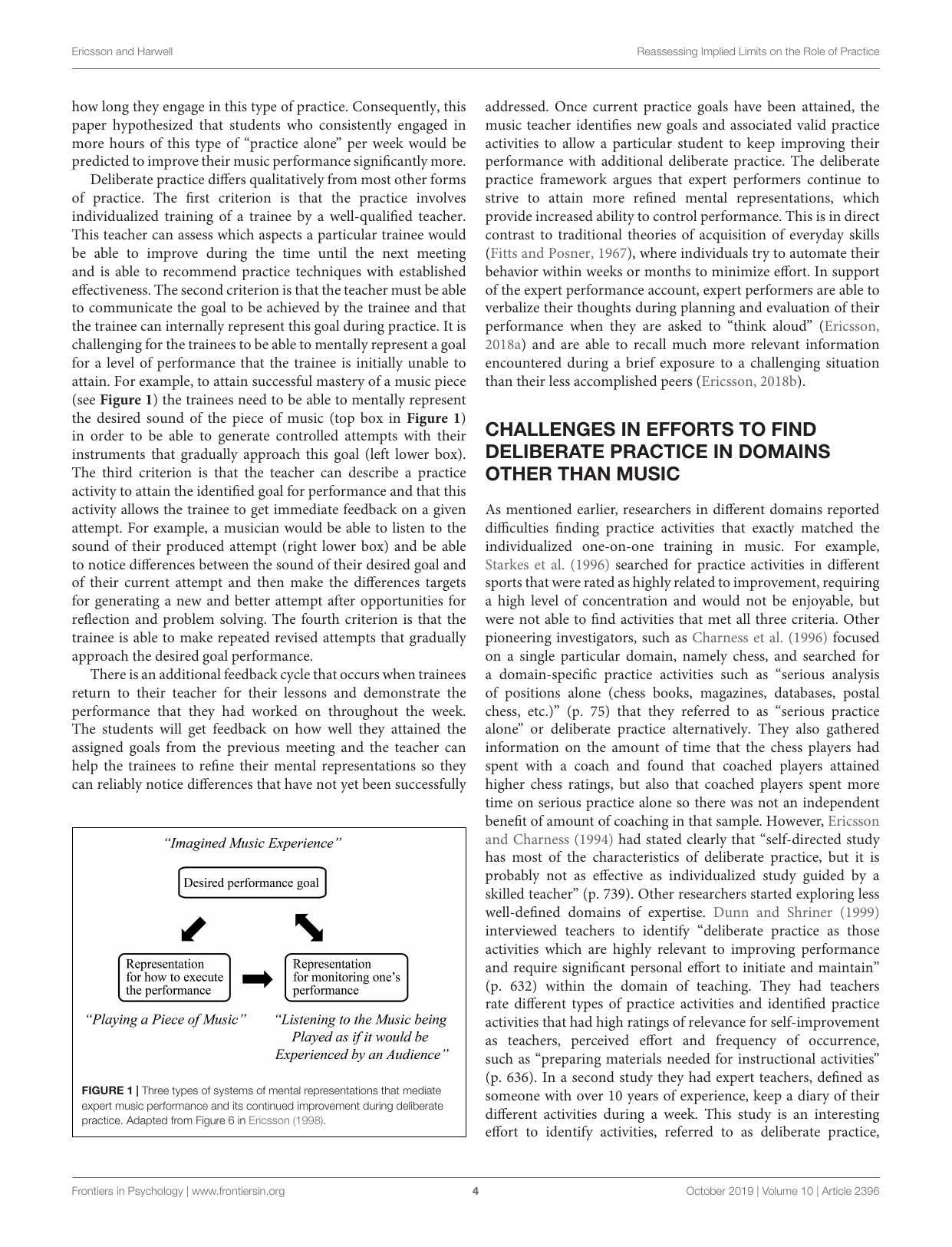
Shows: A simple boxes-and-arrows flowchart showing how a musician's "desired performance goal" feeds into playing, listening, and refining mental representations in a feedback loop.
Why engaging: Clean, minimal diagram that concretely explains what "deliberate practice" means at the mechanism level — good complement to the more data-heavy Figure 2 below.
Shows: A forest plot of 14 studies comparing simulation-based medical education with deliberate practice (SBME+DP) against traditional clinical education — every single study favors SBME+DP, with a pooled effect size of 0.71.
Why engaging: Technically a forest plot (usually a "skip" per the brief's guidance), but unusually clean and tells an unambiguous story — every study points the same direction — which could support a strong "deliberate practice beats traditional training, without exception" visual for the deliberate-practice section.
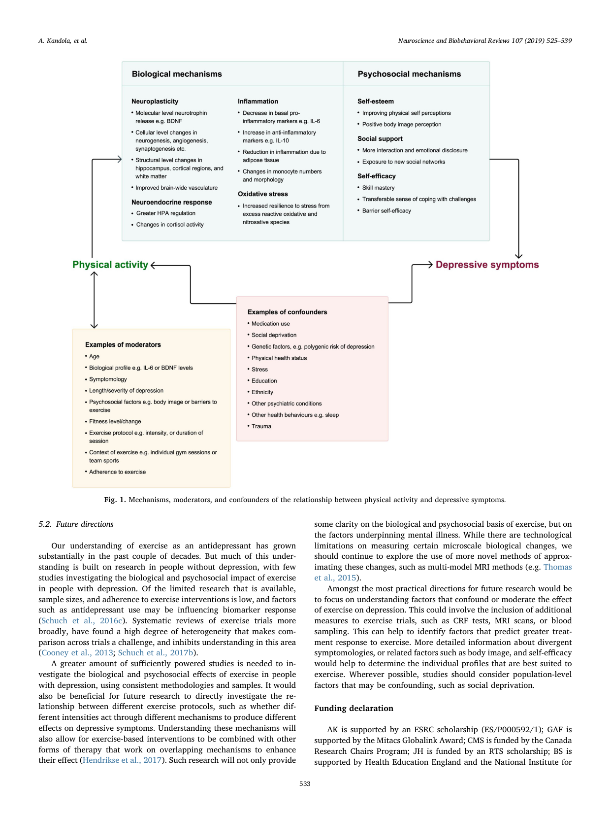
Shows: A clean box-and-arrow diagram of the biological (neuroplasticity, inflammation, HPA axis) and psychosocial (self-esteem, social support, self-efficacy) mechanisms linking physical activity to reduced depressive symptoms, plus moderators/confounders.
Why engaging: A well-organized, colorful mechanism diagram that could serve as a visual template/analogy for the exercise-science comparisons already planned in section 9 (Glass & Stanton, Rand et al., Howden et al.), even though the paper itself isn't about meditation.
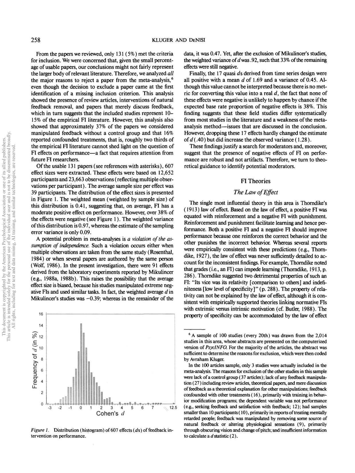
Shows: A histogram of 607 effect sizes from feedback studies, showing that over a third of feedback interventions actually *decreased* performance.
Why engaging: A surprising, single-number-friendly stat ("1/3 of feedback backfires") visualized as a simple histogram — great hook for the "not all feedback helps" argument.
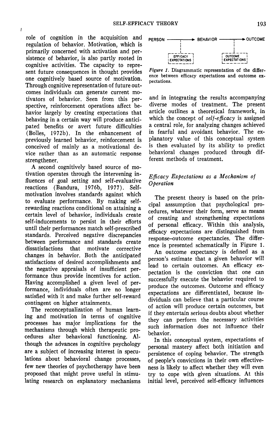
Shows: A minimal box-and-arrow diagram distinguishing "efficacy expectations" (can I do it?) from "outcome expectations" (will doing it work?) in the person→behavior→outcome chain.
Why engaging: The single clearest visual summary of Bandura's whole theory — extremely simple, easy to redraw/restyle for the explainer.
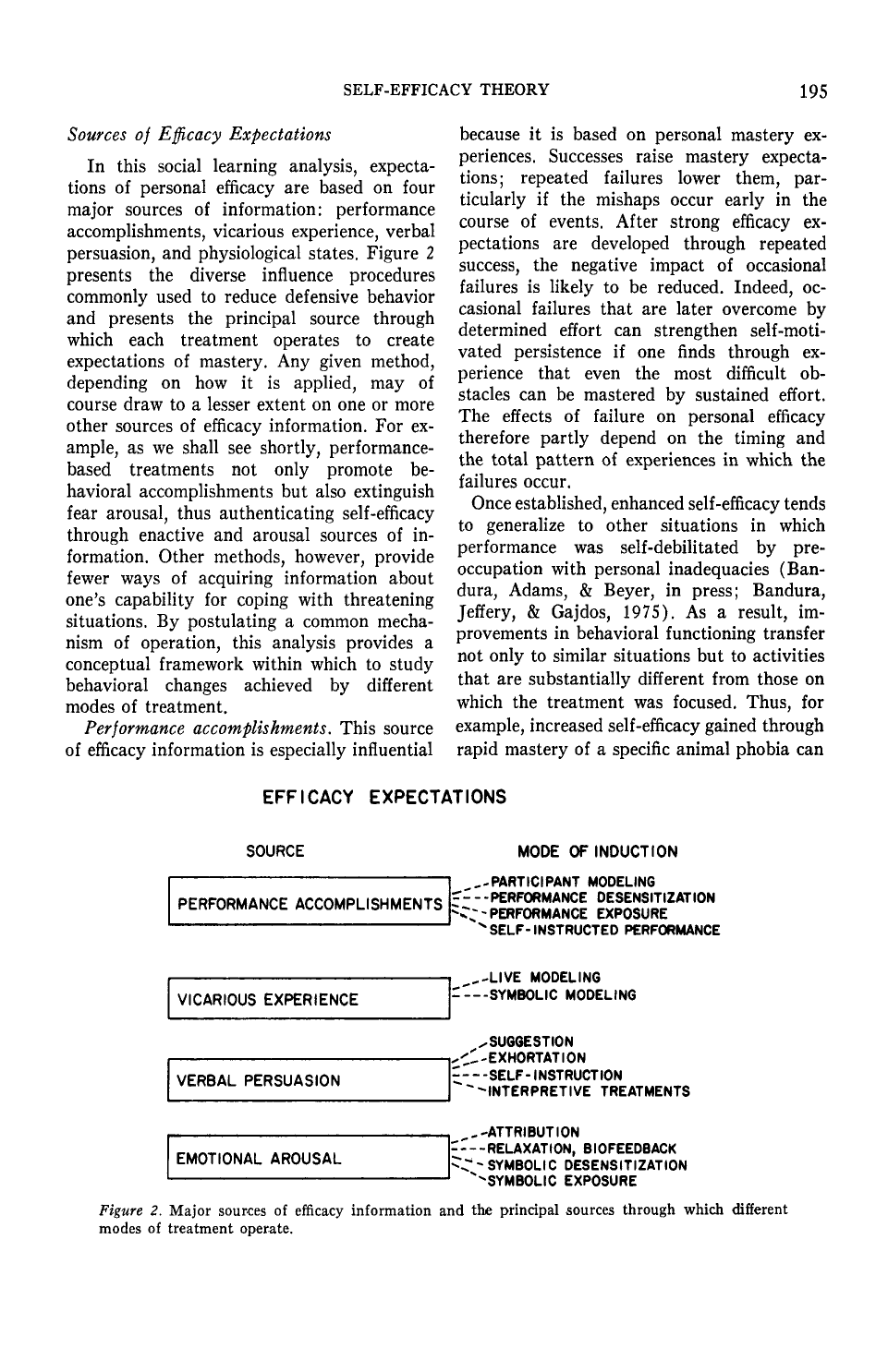
Shows: A four-row diagram (performance accomplishments, vicarious experience, verbal persuasion, emotional arousal) each branching into their specific real-world "modes of induction."
Why engaging: Clean, structured breakdown that maps naturally to an infographic; reinforces the "many small ingredients build self-efficacy" idea relevant to deliberate practice.
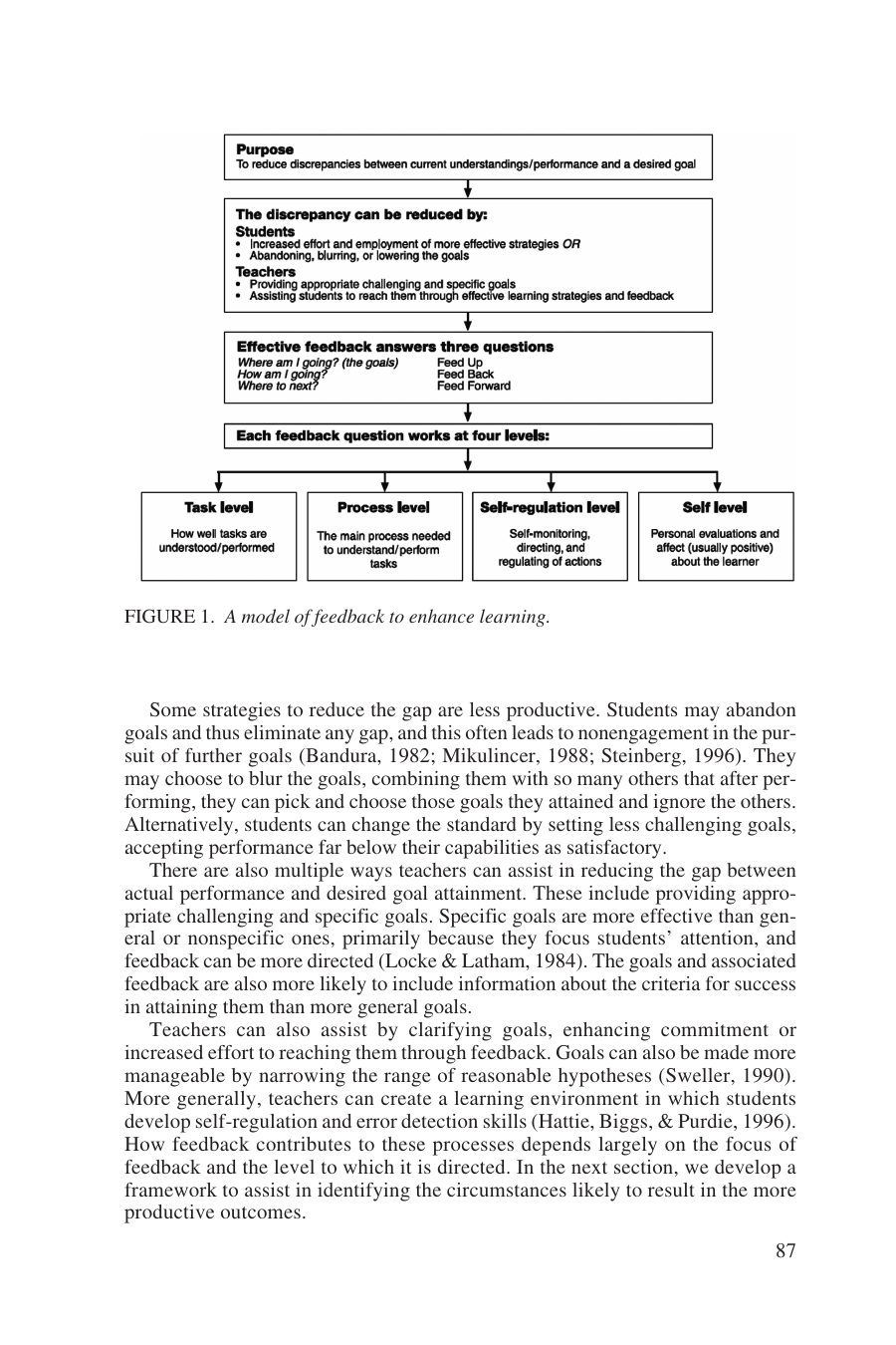
Shows: A clean flowchart: effective feedback answers "Where am I going? How am I going? Where to next?" and works at four levels (task, process, self-regulation, self).
Why engaging: This is THE canonical feedback framework cited directly in Class 1 — it's already a clean, well-designed box diagram that would translate almost directly into a course graphic.
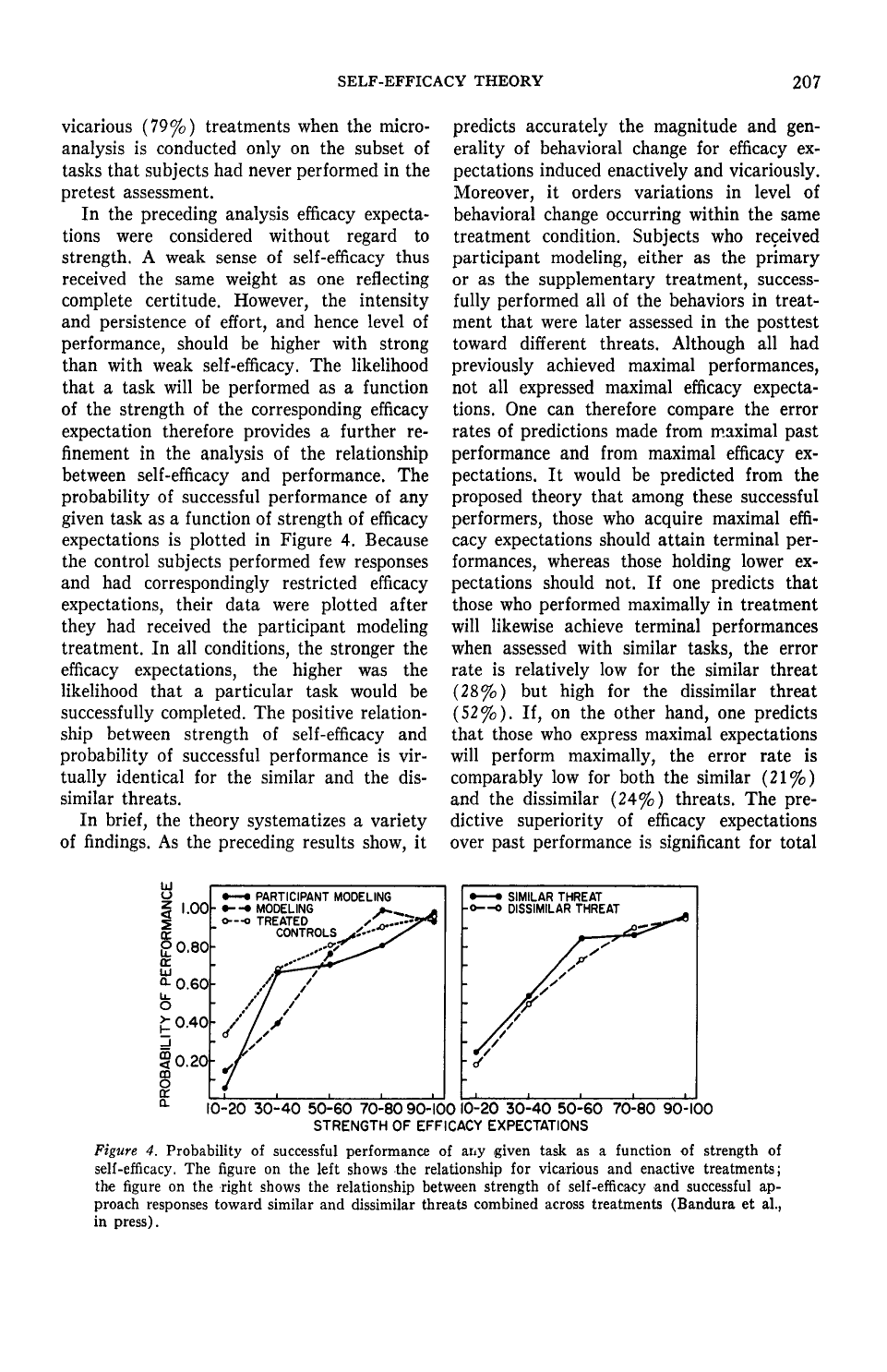
Shows: Two line charts showing that the probability of successfully performing a task rises steadily with the strength of a person's self-efficacy belief, for both similar and dissimilar threats.
Why engaging: An actual quantitative dose-response curve backing up the "belief in yourself predicts behavior" claim — good complement to the conceptual Figures 1–2.
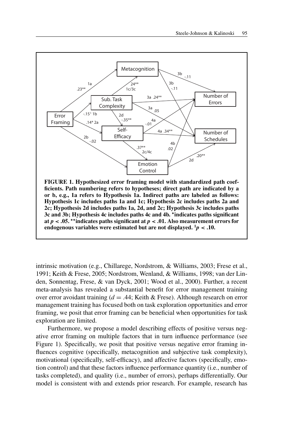
Shows: A box-and-arrow path model showing how framing errors positively vs. negatively affects metacognition, task complexity perception, self-efficacy, and emotion control, which in turn affect performance (errors, tasks completed).
Why engaging: This is the exact conceptual model behind the cited self-efficacy research — good for illustrating "how you frame mistakes changes whether they help or hurt you," though it is a fairly technical-looking path diagram (would benefit from simplification/redraw).
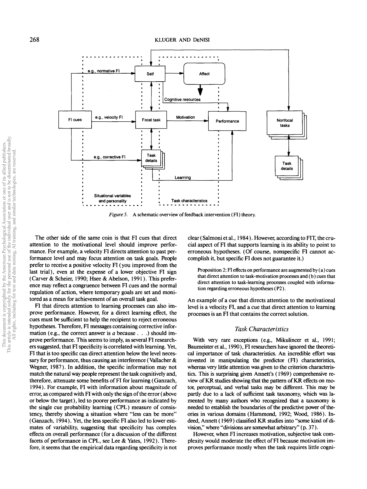
Shows: A box-and-arrow theoretical model of how feedback cues route attention to self, task, or task-details, and how that determines whether feedback helps or hurts performance.
Why engaging: Conceptually rich but visually dense (many small boxes/arrows, 1996-era academic diagram styling) — would need a real redesign to be explainer-friendly.
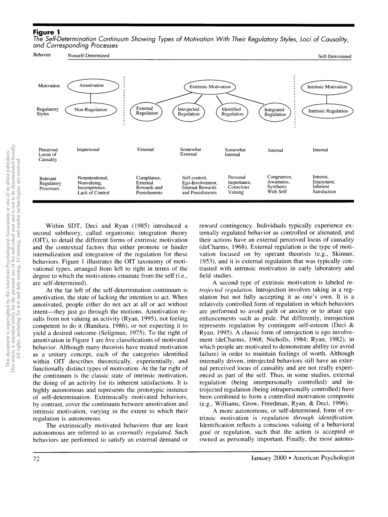
Shows: The canonical SDT diagram — a spectrum from Amotivation through four types of Extrinsic Motivation (External, Introjected, Identified, Integrated Regulation) to Intrinsic Motivation, each row showing perceived locus of causality and relevant regulatory processes.
Why engaging: This is THE foundational, most-cited diagram in self-determination theory — instantly recognizable to anyone who knows SDT, and gives a visual spectrum rather than a bullet list for explaining autonomy/motivation. Plain black-and-white scan, so it would benefit from a redesign, but the content/structure is exactly on-citation.
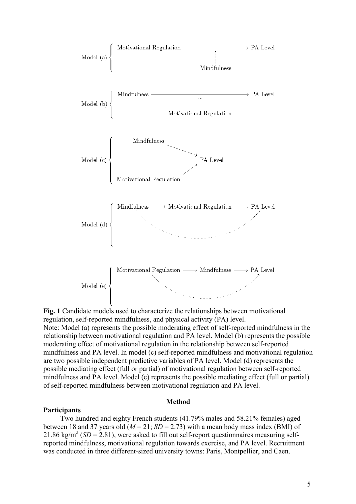
Shows: Five simple box-and-arrow path diagrams (models a–e) showing candidate statistical relationships between mindfulness, motivational regulation, and physical activity level.
Why engaging: Clean and easy to follow, but plain black-and-white academic diagram style — would need a redesign pass to feel like a course explainer graphic rather than a stats textbook figure.
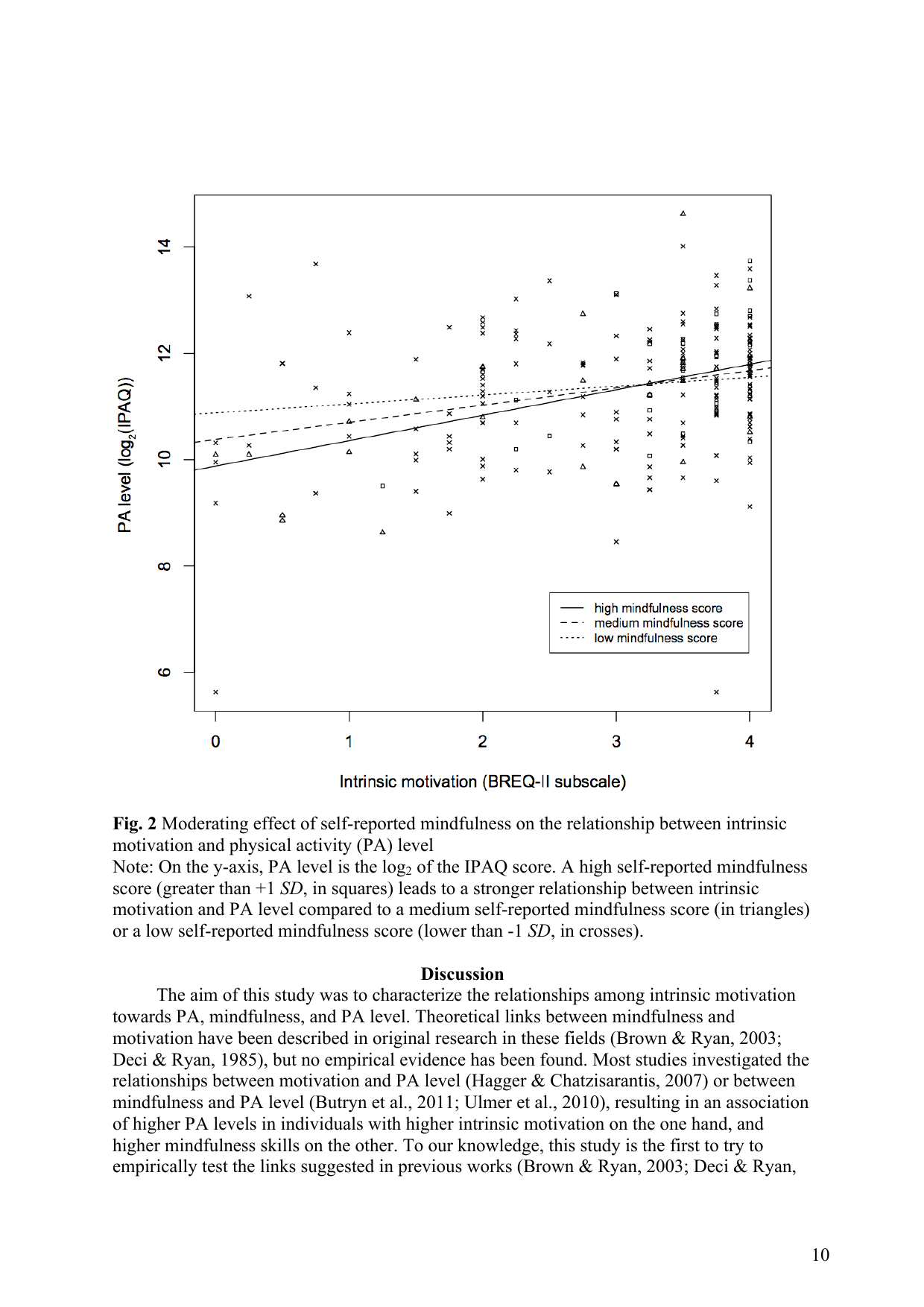
Shows: Scatter plot (default R plotting style) with three fitted lines showing that as self-reported mindfulness increases, the positive relationship between intrinsic motivation and physical activity level gets stronger.
Why engaging: Tells a clean, on-topic story (mindfulness amplifies the payoff of intrinsic motivation) but the raw plot is visually dated/busy (base-R symbols, gray scatter) — low as-is, would need a redraw.
Shows: A clean color-coded dot plot ranking U.S. religious groups (Atheist, Jewish, Catholic, Evangelical, Mormon, Buddhist, Jehovah's Witness, etc.) by the % who say they meditate weekly or more, ranging from 19% to 77%.
Why engaging: Colorful, simple one-glance dot plot with clear labels and a surprising range (77% for Jehovah's Witnesses) — much more engaging than a paragraph of percentages, and reframes meditation as a broad cultural practice, not a niche one.
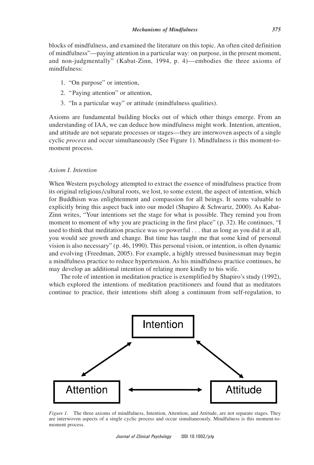
Shows: A simple triangular diagram with three boxes — Intention, Attention, Attitude — connected by double-headed arrows, representing Kabat-Zinn's definition of mindfulness ("on purpose, paying attention, in a particular way") as three interwoven, simultaneous processes rather than sequential steps.
Why engaging: Extremely clean, minimal, easy to redesign with icons/color — a good candidate for a simple "what is mindfulness, mechanistically" explainer graphic, though it is plain black-and-white as-is.
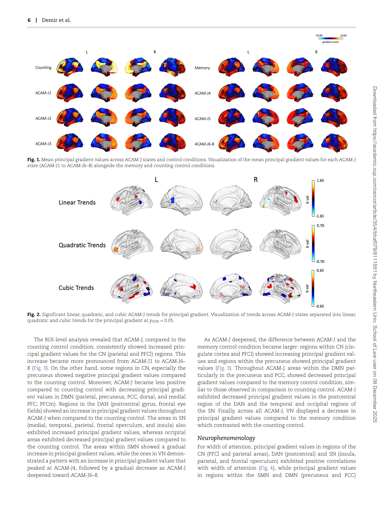
Shows: Rows of colorful brain-surface renderings showing shifting principal-gradient values across successive jhana meditative absorption states (ACAM-J1 through J6-8) compared to control conditions.
Why engaging: Visually striking, colorful whole-brain renderings that literally show the brain "reorganizing" across deepening meditative absorption — a strong visual metaphor for "advanced meditation," though the full figure panel (with radar plots) gets dense; this cropped top panel alone is the cleanest.
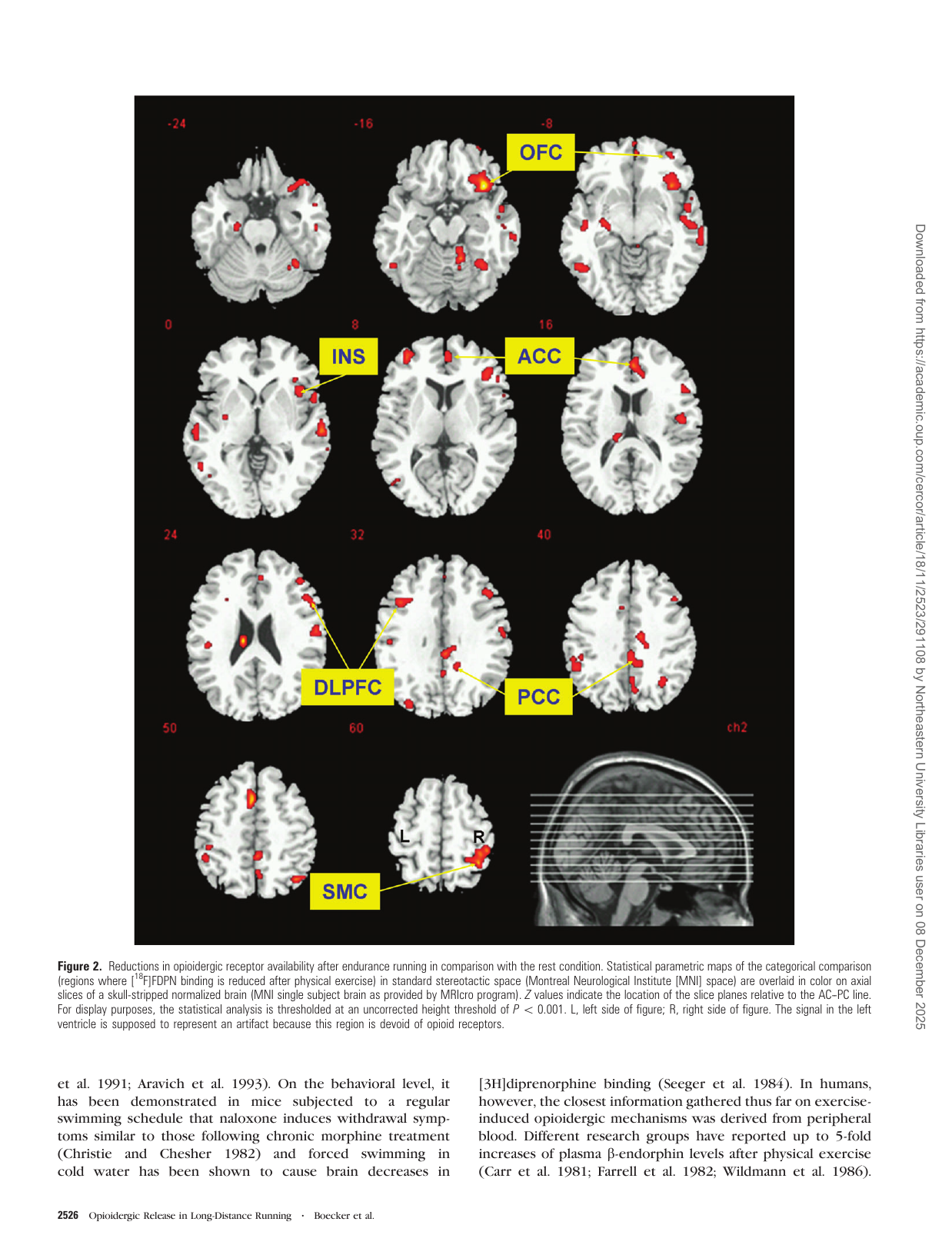
Shows: Colorful axial brain-slice montage (red/yellow activation blobs labeled OFC, INS, ACC, DLPFC, PCC, SMC) showing where "runner's high" opioid release occurs in the brain.
Why engaging: Visually striking brain-imaging montage in the same visual family as other "brain lights up" figures used elsewhere in the course, but this specific paper (runner's high) isn't part of the Class 1 citation list — include only if a generic "brain imaging" visual is wanted.
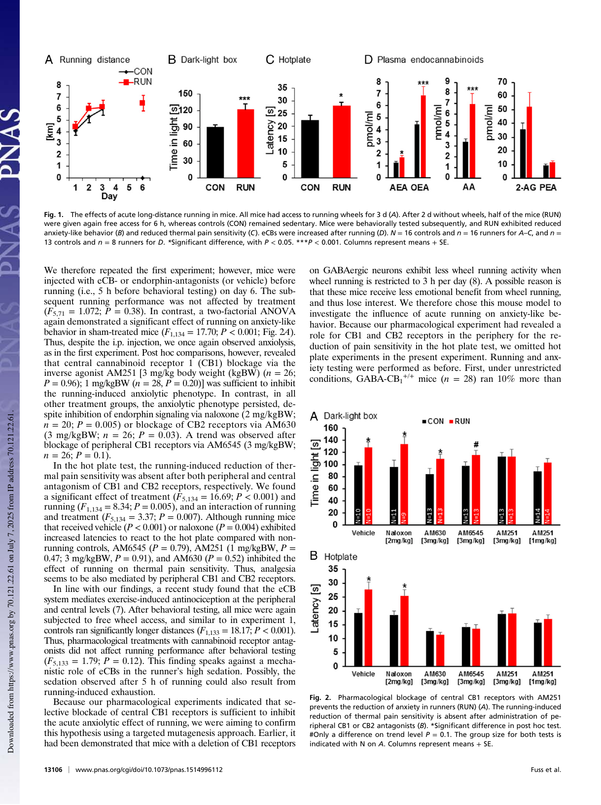
Shows: A four-panel bar-chart figure showing that running increases anxiolytic behavior, pain tolerance, and endocannabinoid levels in mice, effects blocked by cannabinoid-receptor antagonists.
Why engaging: Clean, standard multi-panel bar charts with significance stars; not directly tied to any Class 1 section, so only worth using if the course ever draws a "runner's high vs. meditation reward pathways" analogy.
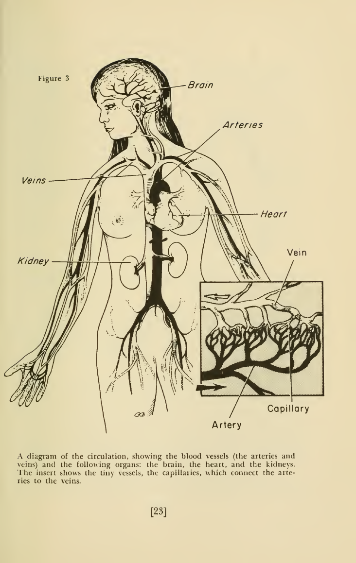
Shows: A vintage anatomical line-drawing of the circulatory system (heart, arteries, veins, kidneys, capillaries).
Why engaging: Charming period illustration style, but it's basic anatomy-textbook content rather than data or a meditation-specific finding — decorative use only.
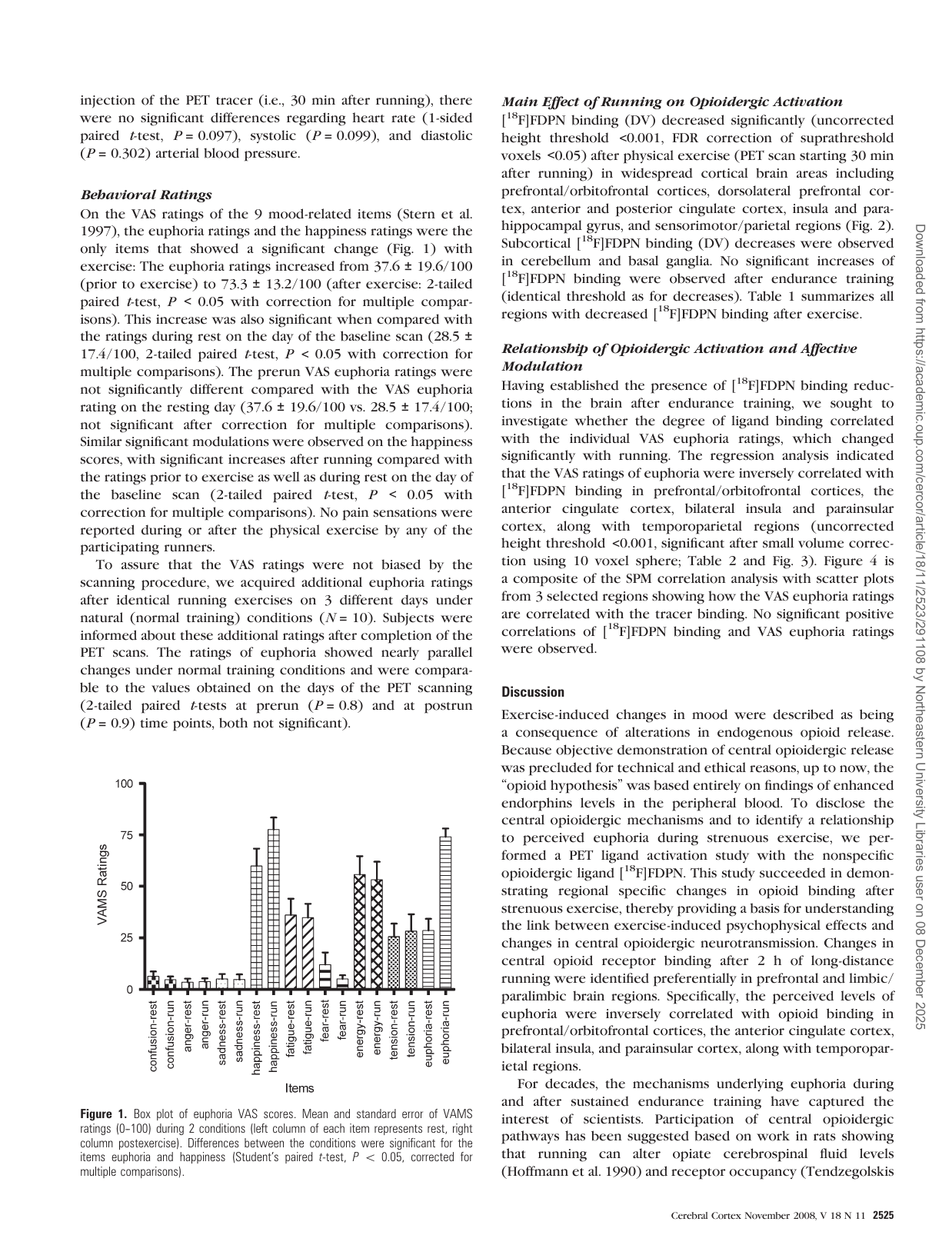
Shows: Bar/error-bar chart of mood ratings (confusion, anger, sadness, happiness, fatigue, energy, tension, euphoria) before vs. after a 2-hour endurance run, showing euphoria and happiness rise significantly.
Why engaging: Clean behavioral data chart; only loosely relevant since this paper is about running/opioids, not meditation.
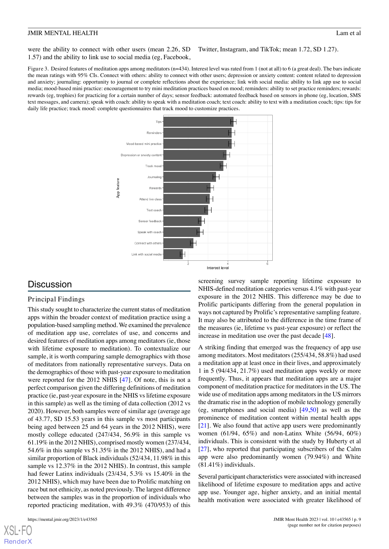
Shows: A bar chart ranking which app features meditators most want (tips for daily practice, reminders, mood-based mini-practices, etc.).
Why engaging: Clean bar chart, could support a "modern meditation practice" sidebar, though it's a secondary/backup option next to the concerns chart above.